

The upstairs guest bath is coming along, not there yet, but coming along. I LOVE the tile, the polished nickel finishes, and the sweet little window. This is a new bathroom that you guys convinced us to put in upstairs on the bedroom floor (and we are happy we did). So many of you suggested that we’d want this specifically when the kids are older so they can each have their own bathroom. They already shower at the same time, one in here and one in the kids’ bath, which cuts down on “bathtime” by 20 minutes. I swear from “time to take a shower” to downstairs in PJs is a solid 45 minutes for whatever reason – and not because they are taking long showers. Distractions! So many distractions. I’m going to start guiding them blindfolded to do their tasks because my goodness they get so distracted by the dogs, the sewing machine (“Is now the time to make a pillow for Sue Sue, Charlie?”, A piece of paper that could be an airplane, a pokemon card that HAS to be set out to bring to school tomorrow, and again the dogs”… “but mama they are soooooo cutttttte”)… Anyway, yes, they use both twice a week and I’m glad this is an option. So let’s revisit where we are in the house: The Guest Bedroom


We are upstairs (ignore all the sunroom, kitchen, and TV room stuff–that is all on the first floor). You walk upstairs and there is a large landing which we love, three bedrooms, a hallway shared bath (which I showed you in this post), a guest room (Permanent-function TBD), and this new small attached full bath. We were spoiled (and spoiled our guests) with ensuite bathrooms at the mountain house, but we weren’t going to put an extra bath up here originally (“Guests can share with the kids!” We said) but it is so nice for guests (and since Brian writes in the guest room this has become his personal spot. Ahem). The vision for this guest bath was similar to the other rooms – have one high-impact color that we’ll never get sick of, but keep it simple and very high quality. We’d bring in more style and risk with the less permanent finishes and fixtures, but stay more classic with tile and plumbing. I’m still sorting through what level of regret I have in this bathroom – some days none, other days I feel like I know what I would have done differently to, you know, jazz it up a bit. 
For this bathroom, we fell in LOVE with this deep mauve/rose-colored pink tile from Pratt + Larson and paired it with polished nickel finishes. The combination is so beautiful, but the room doesn’t feel complete yet (likely because it’s not done). Here’s where we are at today: 
There is a lot of backstory that affected some decisions until those elements changed, but the decisions didn’t – let me explain. This bathroom was stolen from one of the original large bedrooms, and therefore it has a massive bedroom-sized window in it that would have landed between the sink and the toilet. It was relatively close to the ground (about 20″ off the ground) which meant that it would be below any normal vanity and not allow for a normal backsplash. For that reason, we knew that we needed a pedestal or console-style vanity, i.e a sculptural base that could be in front of a window, and ordered this one from Rejuvenation. It’s a quirky solution to an older home remodel and one that was actually really cute (before we changed it). We’d have an oversized window in here, with a pedestal sink in front of it and an accordion mirror coming out the side. For this reason, we also needed a pedestal sink with an integrated backsplash since it would be in front of the window. If you are confused, here is where it was before: 
This is the bedroom off of the guest bathroom before we created the bathroom. Are you following? So what we did was steal from the nook in the bedroom and the hall closet to create this 5’x7′ (ish) new bathroom. As you can see from the original photo the window that was going to be incorporated was big (and beautiful). 
So as you can see, with the larger original window the vanity couldn’t be a typical storage piece – it needed to have an open base and be freestanding with an integrated backsplash (i.e. again, pedestal or console). We found the perfect one via Rejuvenation and called it a day. Great. But then, a few months later we realized that the house on the exterior seemed to be missing a window. We didn’t really realize it originally because the whole house had funny awkward windows (and that’s ok for an older home!). 
Once everything was demoed and cleared out and the new back-covered porch was going to be such a pretty view, we realized that we need that 4th window. We did some window configuration and realized we could take another one of the unused original windows from downstairs (one of the smaller ones in the entry) and put it up in the bathroom, which would be a better scale for that bathroom. It wouldn’t be operable, but that’s ok (there is a fan). But it was smaller and since we had to reframe it anyway (HOT TIP: do this before re-siding) this felt like a smart swap. We’d put the original large bedroom-now-bathroom window back into the bedroom (matching perfectly) on the much-needed west exterior wall and then add this smaller leftover window in the newly created guest bath on the east wall. It was window musical chairs and it hurt my brain for a while, but so glad we did it. Here is what it looks like on the outside with the four windows: 
So much better and since this back porch and view have become such a feature of the home I’m SO GRATEFUL that we did it. Thank you, Jamie and ARCIFORM. If you want to watch a full video tour of this bathroom & where we want to take it, then here she is (just wait for the ad to play!): 
Sconce | Faucet | Faucet Supply Lines | Outlet Cover | Toilet Lever So now that that was done, no one realized (including me) that at this point we could have swapped for a different vanity with more storage, or something more custom. Now, to be honest, I’m totally fine with this because this is such a cute pedestal sink, was affordable, vintage-y, and because it was a “one and done” piece it did save us some money by not tiling or fabricating stone for a backsplash. And listen, in order to get a window in there it was always going to be awkward so we decided to do the least awkward thing and center it between the shower and the wall – thus not right above the vanity, but leaving enough room for an articulating mirror. Remember this is the guest bath and maybe a future kids’ bath. But not ours:) 
Towel Bar | Shower Set | Shower Head So here’s where we are. Everything is good and fine and great, but when I walked into this bathroom after renovating for so long I felt this slight pang of disappointment and I didn’t know why. After much thought and a few private tears, I figured it out: 1. The grout color that I loved so much (“matches perfectly” she said) made it so the wall of incredible tile felt flat. I think this move of matching the grout with the tile could absolutely work (and does) in a room with a lot of natural light that reflects off the tile, showing the texture and color variation. We did this in our main bathroom on the floor and it’s PERFECTION. But up here? Without a lot of light (the photos make it much brighter) the tile feature wall just looks dark. Can I change the grout? I mean, you can do anything but it’s a thing. I know that over time grout lightens with soap, hard water, and just general wear/tear so I feel ok about letting it just do that naturally. You could dremel out the top layer of grout (on each individual grout line) and then grout over it, but I’m not there yet. I don’t hate it, I just wish it were lighter so the grout lines would create more of a pattern (literally what I didn’t want to do at the beginning because I didn’t want it to look/feel busy). That’s all to say – if you have a ton of natural light, going tonal with the grout and tile is a great move, but if you have no natural light, contrast the grout so that the tile pops more, adding interest and pattern. End of hard lesson:) But that’s not it… But then I remembered that wallpaper exists and that I can shake it up through (minor) accessorizing. Hope reemerged and I got to work. So let’s show you what is happening: The Articulating Mirror

I found this vintage polished nickel at Portland Architectural Salvage and snagged it pretty quickly. I LOVE the polished nickel fixtures in here (from Rejuvenation) and was happy to find a mirror that works with it and can swing in front of the window. 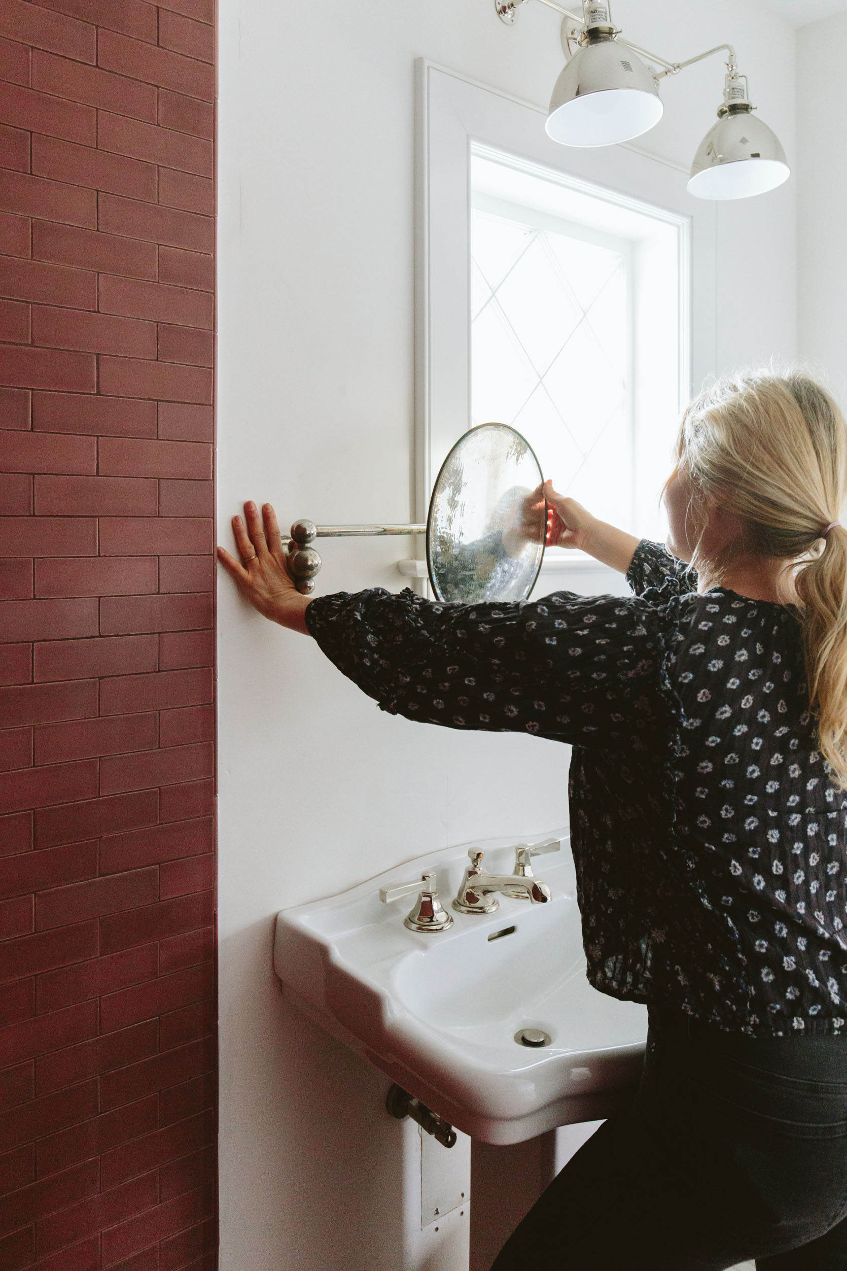
Of course, this is not the bathroom nor mirror to get ready from prom in, if you know what I mean. It’s a real gift I have of finding extremely distorted antique mirrors that barely reflect your face. As you can see she is old and the paint on the back (the mercury that created the mirror effect) is chipping off. I haven’t hung it yet because we have yet to wallpaper, so I still have my eye out for another solution that might give Suz less frustration when she is putting on her lipliner. At the same time, I could also just put another mirror on the wall by the door. I’m not concerned about it AT ALL (likely because it’s not my bathroom) and I feel like not every room gets to be this super dialed 2023 luxury. The Wallpaper
I got pretty excited about putting wallpaper in here, but have yet to make the final decision. Brian and I agreed quickly on this House of Hackney London Rose pattern and we called it a day…until I became unsure of which kid will ultimately “get” this bed/bath when they get older (if either). If it ends up that Charlie (the oldest) moves in here then he’s already told us he does not want a pink floral wallpaper and you can balk at that if you want, but any parent of a seemingly cis male boy won’t try to make it a bigger thing and force it (because that is a weird parenting move and I want to respect who he is and give him a shot at loving this bathroom). I get it and so I’m taking a second to figure it out. Maybe neither kid “gets” this bathroom and the bedroom remains a guest room, with one of them more dominantly showering or getting ready in here when older. It seems easy to let Birdie have it (she is a HUGE FAN of that wallpaper), but she also likes to take baths more and I’m unsure if when she is a tween/teen if it makes more sense for her to “get” the kids bath with the bathtub. Again, I’m not concerned about it at all, this isn’t a real thing, I’m just working it out here in real-time and I really don’t want to replace the wallpaper in 4 years nor do I want Charlie to feel silly or embarrassed showing his friends his room. So is there a wallpaper that could offset the femininity of the pinky/rose just in case? Maybe! I’m waiting on Kelly Ventura’s new samples to get to me (which are likely to do the trick) but meanwhile, I’m going to look around a bit and see if there is something that might make more sense for more family members, long term. The feminist in me wants to make men deal through a few floral wallpapers as we have DEALT with centuries of systemic patriarchal oppression:). But the loving mom in me wants my son to feel like his room represents him as much as Birdie’s room represents her because he’s wonderful, not to blame, and has done no such oppression in his 9 years on this planet. I’m also kinda laughing to myself right now as the tone is so hard to portray in writing (is it time for a podcast?). Why oh why would I open up this conversation in a seemingly innocuous progress post? Who knows. Silly, Emily. But I guess I want you to know why I’m not immediately installing that pink floral wallpaper. Lastly, and with less gender controversy, we were going to do a shower curtain in here to save money and bring in some sweetness, but once I realized that the room needed more pattern (aka wallpaper) I knew that a curtain wouldn’t do and we’d have to put in a glass shower door. You can have a shower curtain with wallpaper, but it’s not terribly advised for overspray and general moisture reasons – especially in Oregon where it is so humid in the winter. I just finalized the glass order and it should be installed in a few weeks, and then I’ll hopefully pick a wallpaper, install the mirror (and that sweet antique polished nickel cup and toothbrush holder), and be done with this little lady. If I’m being honest no matter what wallpaper I choose this bathroom is inherently going to be relatively on the “feminine” side (pink + pedestal sink + wallpaper will do that to a space) so you might see this original wallpaper back up on the walls in a couple of months because that’s what Brian and I want. Stay tuned ? Resources: *Photos by Kaitlin Green The post Farmhouse Guest Bathroom Update (And How I Feel About The Tonal Grout Choice) appeared first on Emily Henderson. Originally from Emily Henderson https://ift.tt/LZ3M2Jr
0 Comments

From Emily: I’ve been a MASSIVE fan of Ben Medansky’s for years and years – his sculptures are so provocative and full of such spirit. I forget if he reached out to me or vice versa, but he invited me over to his home, and I was immediately blown away by every inch of it. Like a true artist, there was this sense of unbridled creativity, yet in a way that was still totally livable. I wish there were more homes of creatives that we could take our kids to because exposing them to homes like Ben’s that are full of color, whimsy and so much quiet rebellion is wildly inspiring. I hope you love it as much as we do. 
Hello friends, Ryann here to be your virtual guide through yet another stunning home tour featured in Emily’s book, The New Design Rules. As Emily prefaced above, you are about to get a glimpse inside the home of Ben Medansky, and not unlike his art, his home is endlessly inspiring and encompasses bold uses of color with a breathtaking mix of modern and vintage elements. One of the many things I am so drawn to about his home is how effortlessly the Mid-century modern furniture blends with his contemporary art, pops of bold color, and notes of industrial influence. It comes across as effortless, but anyone who has dabbled in mixing styles knows this is far from easy to do so. There is a noticeable balance between different styles and colors that creates a highly lived-in, personal feel. 
This room is one of my favorite examples of how to create a space that is personal and straightforward, yet totally unexpected and creative. Despite the amazing use of bold color, this home isn’t maximalist and despite the white walls and wood tones, it isn’t minimalist either. It toes the line between both by perfectly balancing bold modern elements with understated timeless decor. Not surprisingly, this is also mastered through his displays of art (some his, some by friends of his). If you are already familiar with Ben’s art (and if you aren’t yet then consider this your introduction), you probably guessed that the awesome ceramic totemic piece is one of his. He made this one for himself and I really love how perfectly it suits this room. The colors play off the rest of the decor and furniture, it adds a lot of texture, and the height is crucial to draw your eye up to the incredible high ceilings. 
When it comes to living room layouts, having the back of the sofa face out toward another common area is not the most ideal but sometimes it is the only layout that makes sense (which is obviously the case here). A hack we normally suggest when this is the only option is to drape a blanket or vintage fabric over the back of the sofa to create some visual interest. But clearly, this sofa has no need for such a hack. It is an extremely special piece by Stephen Kenn with a metal base and leather belt strappings to keep the cushions in place. It’s functional art as far as we are concerned, so hiding the back of it against a wall may as well be a crime. Luckily, this living room calls for the sofa to “float” out in the open so we all can enjoy a full 360-degree view of the stunning sofa. 
The back of the sofa calls for a close-up. The contrast between the brown leather straps, metal frame, and bright blue cushions is really striking. 
The kitchen is quite simple and utilitarian except for that incredible island so I had to ask Ben to tell me more about it. He told me the kitchen island was custom-made by Eddy and Astrid Sykes of wrinkle.MX who also designed and built the house. The front of the island is made of cast fiberglass and the top is a custom-edged and honed Carrera marble slab. It’s incredible. 
On the opposite side of the kitchen island, the light wood drawers and Carrera countertop create some warmth to contrast with the steel appliances and concrete floors. I LOVE this juxtaposition and how it adds depth and nuance to the space. For the drawers, having circle cutouts instead of hardware adds to this straightforward yet creative style that is carefully exuded throughout the home. We have talked about those pendant lights on the blog before because they are a great example of breaking a design “rule”. The unspoken “rule” is that an array of lights in a line like so should match one another to maintain continuity and to prevent a space from feeling unfinished or random. Here, the pendants are matching except for their color which is a really cool design risk that 100% paid off. The fact that they go from light to dark creating an ombre effect makes it feel intentional yet totally unique. 
The all-steel stove and counters drive home the industrial style that grounds the home. This utilitarian vibe mixed with contemporary art is really exciting. 
We never take for granted the power of natural light here at EHD, and it is safe to say this home is dripping with it. The kitchen and dining area open up to the backyard with huge floor-to-ceiling sliding doors which allows so much beautiful natural light to flow through. The skylight in the living room always helps, too :). 
Now onto the bathroom, where this vintage pink dresser-turned-vanity paired with a black accent wall creates such a dynamic look. I love the choice to continue the paint color up the ceiling so it encompasses the room (but he didn’t paint every wall so the color isn’t too overwhelming). SO good. 
It is very rare we show toilets on the blog (because, well, you know) but I love how simple this one is. Mounting it on the wall partition is very modern and dare I say elegant. Also, please note the salvaged graffiti door to the left. It’s just another highly creative decor element that speaks to Ben’s style and brings a ton of personality to the space. 
I adore this clawfoot tub and love that the black accents tie in the paint color and tile. It creates continuity without being too expected. 
This open shower and bathtub nook is really incredible. The way it is open to the outdoors helps drive home a natural, airy feel that is completely intoxicating. I also love how the plants add to this effect (and now I am thinking I want to see more plants in showers!). 
In the bedroom, a vintage wall-mount sliding barn door brings in so much soul. The fact that it is so tarnished compared to the clean white walls creates such an exciting contrast that I just can’t get enough of. And again, dark wood MCM furniture plays into the simple, straightforward style, and then the bold colorful art provides a modern flair. I could stare at this home all day but unfortunately, this concludes our home tour of the day. I hope you enjoyed it as much as I did, and huge thanks to Ben Mendansky for sharing his incredibly inspiring home with us. xx Design by Ben Medansky | Styling by Velinda Hellen and Erik Staalberg | Photos by Sara Ligorria-Tramp The post Step Inside Artist Ben Medansky’s Colorful, Modern-Industrial Home appeared first on Emily Henderson. Originally from Emily Henderson https://ift.tt/bxkieIG 
Happy Sunday everyone. For EHD this was an exciting week between Emily’s mudroom reveal (see above but also go read the post if you missed it), Em’s new pool install (and the drama that unfolded – see her Instastories or you can wait for the blog post), and lastly some fun developments on the MOTO (Makeover Takeover) front. However, we likely don’t need to tell you that it has been yet another devasting week in the United States. It continues to be heartbreaking that guns and the lack of common sense laws seem to have a higher value than actual human lives. One of our favorites, Gabrielle Blair (aka DesignMom), has yet again made some very important points on this issue. Whether your gut is to agree or disagree before reading maybe just take a moment and have a look. We can’t get numb. This week’s home tour is a stunning apartment in Mexico City (as if we needed yet another reason to love that magical place). It’s funny because when you see the space you don’t immediately clock that its architecture is really contemporary because of how it is decorated. The soothing colors, the amazing vintage from the owner’s travels, tons of different textures, and of course the magic of limewash paint. Our favorite detail might be the limewash accent walls under the stairway. It’s a perfect example of when an accent wall makes sense (because there’s an architectural reason:)) Go check out Natalie Stoclet’s home on Clever. 
From Emily: The salad tool that makes my salad taste like a $16 salad from a professional salad store. I know it’s soup season but hear me out: I was making a salad over the holidays for all the adults and my BIL was like, “Oh you should get what I have – the metal bowl and salad cutter thing that chops and mixes everything perfectly”. He sent me the link, I ordered it, and have since used it every lunch, joyfully, as if I’m behind the counter at one of those fancy salad places. It mixes and chops everything small enough that you get all the ingredients in the same bite – CRUCIAL to pure salad enjoyment. With a few whips of the wrist, your salad goes from awkward and clumsy to gourmet. No one, I mean NO ONE wants to eat a whole broccoli floret in a salad (Brian and I differ on this so technically Brian does) but once finely chopped and mixed in you can put more veggies in a way that tastes just so good. From Mallory: I want this book and I want it badddd — Colin King is an insanely talented stylist (you’ve probably seen his work before if you don’t already know who he is). Every time I see a photo that makes my jaw drop I look at the crediting and the tag is @colinking. If you’re interested like I am, you can pre-order the book here! 
From Ryann: I think all pet owners can agree that having pets can come with certain…odors. To that end, I like to use this deodorizing spray after I bathe my pup to help him smell fresh and clean longer. It has a subtle kiwi scent and the baking soda really helps keep his coat nice and clean. 
From Caitlin: As promised in my earlier post this week – a before & after shots from vacuuming with my new Dyson V15 after two weeks of cat fur and laundry lint buildup (I wanted you to be able to see the difference, too!). GUYS. This thing is extraordinary! It weighs 6 pounds, it’s easy to maneuver, and it pulls up SO MUCH GUNK – my former corded vacuum literally cannot compare. It took less than two minutes to take this rug from “yikes” to “freshly unrolled,” which is a literal dream come true – after 10 years of opting for tan rugs (in the hopes of concealing my cat’s fur), it’s SO EXCITING to find a tool that can keep my bold, rich, jewel-toned pieces looking like new. It makes me excited to source some more saturated floor coverings for the rest of my apartment:) The laser tools are incredible, too. (It shoots out a green light that highlights dirt and dust that’s invisible to your naked eye!). It’s a splurge, but it’s a blast to use, and IT ROCKS. So effective. I wish I could buy one for all of you!!! From Jess: Y’all the “Les and Jess Take Paris” trip is officially booked!! I’ll be there at the end of February so it’s going to be cold. Because bodies can never stay constant (side eye) I needed some new pants and got these cuties from Abercrombie. My faint attempt at looking like a cool (but unstated) Parisian…ha. Also From Jess: Speaking of Paris, pretty please give me all of your Paris vintage home store/flea market recs! We’re willing to travel a little outside of the city if necessary:) I promise to make a reallllly good blog post out of it! GREAT SALES: Lulu and Georgia is having their annual rug sale and is giving 20% off with code RUGS20 (even rugs that are on sale!) Alright, that’s it for today. Enjoy the rest of your day, hug your loved ones, and stay diligent. xx Opening Image Credits: Design by Emily Henderson and ARCIFORM | Photo by Kaitlin Green | From: Farmhouse Mudroom Reveal The post The Link Up: Emily’s Magical Salad Chopping Tool, Caitlin’s Vacuum Show & Tell, And A Plea For Paris Vintage Shopping Recs appeared first on Emily Henderson. Originally from Emily Henderson https://ift.tt/65U248m 
Despite the weather being different up here than in SoCal, I love the few months after the holidays when I hunker down, stay in every night, make so much cozy food, and recommit to an exercise routine that was forgotten during most of November and December. Honestly, part of it is just the need for endorphins during the darkness, and I am forever grateful for these dogs that force me to walk in nature for 1-2 hours a day (which is a huge mood boost and very missed when I don’t do it). So today I’ll show you the pieces that I wear inside (for yoga classes and Pelaton rides) as well as the base layer when I go outside and the different jackets and coats that I need for different temperatures or weather. If you have coat confusion and never know what coat you need for what weather or temperature, you are not alone. I’ve figured some things out. Matching Sets (That Are Also Easy To Throw On A Top For Zoom Calls)
I booked a partnership with Vuori which I said yes to immediately because almost everything that I’ve bought from the I’ve loved (this post isn’t sponsored, just instastories, but I wanted to show you here because I love them). I bought these leggings recently (which I’ve linked up before) and couldn’t believe how soft they were and proceeded to buy two more (and then Oscar ate the crotch out of one of them so I’m back to two). So I knew that for this brand (as well as for most) I like to size up in leggings to be more comfortable. This patterned version I’m wearing is a bit slicker, but still extremely comfortable and very, very flattering. I can wear them all day every day – they don’t cut in anywhere and the subtle pattern makes them forgiving – it shows nothing underneath. I can’t HANDLE when pants are thin and you see all the bits and bobs – the fabric technology is so much better now so don’t settle for this if you don’t want to. 
I rarely wear a tank top because I’m self-conscious, which is dumb, but I’m more comfortable covering them up. I recently started back into a heated yoga class and I need to wear less clothes so I don’t DIE. As far as the tank/sports bra – this one has a support shelf and shaping pads (that don’t add too much bulk, they just give your ladies a nice shape). I can definitely wear this for yoga, but not anything too high impact as it’s not a super supportive sports bra (but again, I have large 43-year-old natural lady DD boobs, so they like support if I jump up and down a lot:). I love the cut of this in front and back – it doesn’t cut in in the armpit at all (I’m wearing a medium) and I like a racer back. The tank stays down more than any other (you can watch some yoga moves in stories if you want to see it in action). I’ve historically not worn super cute matching sets because I don’t love wearing really tight or small clothes, but this set is so cute and it changed my mind quickly and made me honestly just feel a little better/cooler. I like the peek of the mid-drift without showing off too much in different poses. 
I’m pretty sure I’m watching Cody ride, listening to Kelly Clarkson, as we were shooting this (IFKYK). This gray tank is so cute but less supportive than the other. Brian is a fan, FYI, so I wear this more for weight lifting in our bedroom (until we figure out where we are going to put all our home gym stuff) and like it for more mellow Peloton rides (not the HIIT and hills ones). These pants are also excellent. A different cut than the others, in a dark camo which is again flattering and forgiving. 

T-Shirt (similar) | Tank | Leggings | Shoes (similar) I put this together so you could see my favorite pants but they are all sold out in black (stay tuned). I’m more likely to go to yoga wearing this crop top and then de-robe when it gets hot, revealing my tank underneath. Also, I couldn’t find my mat so yes, that is a bathroom runner turned upside down, fooling even myself:) 

My Base Layer For Colder Days – Mostly Dog Walking
After walking the dogs for a year and a half up here I’ve gone through a lot of coat confusion and there is NOTHING worse than when you are 2 miles away and you are either A. still cold or B. sweating inside your coat. So I start with a good base layer then let the temperature of the coat match the weather. It’s a patented formula, science-backed. 

Top (similar) | Bra | Leggings | Socks These awkward poses are because I was trying to show you both the finger holes on the shirt (which keeps my hands colder) AND the pockets in the pants for my cell phone. These pants are on the warmer side which is good if I don’t want to wear a long coat. They also have great compression, which is so good for a fast performance. That shirt doesn’t look anything special but I find the cut more flattering than longer cuts. I couldn’t find the shirt online, but this one looks very great and similar function. What you can’t see is the most supportive sports bra I’ve bought in a long time (great for high-impact anything – I can run again!!) as it has clasps and zipper in front and clasps in the back. Neither pants nor sports bra are “sitting around the house” comfortable, but they are both high-performance for HIIT workouts or when I muster up the willpower to actually run the dogs. Solving My Coat Confusion – What I Wear Outside On My Long Dog Walks
Coat (similar) It should be known (again) that I was a professional dog walker in my early 20’s in New York – a job that I really loved and clearly, it turned into a very committed daily hobby (can walking be a hobby? If so I’m really nailing it these days). But it took me a while to dial in my dog-walking attire in the PNW winter months. I don’t want to layer because I don’t want bulk or to feel claustrophobic, but I hate being cold and definitely not sweaty while it’s cold outside. You have to strategize and I take it very seriously. I start with a good base layer that is thin but warm (above), then I need to calculate the temperature and the precipitation chances to choose the right coat for the time of the day (and the time of day matters!). I want to warm up quickly but not get sweaty on mile three. This first one is my 20-40 degree coat that I wear especially when I don’t want to change into super warm pants. I can wear any of my above thing and comfy leggings, throw this coat on and I’m warm from my neck to my ankles (I hate cold legs). It is extremely warm and if I wear it when it’s 45+ degrees, on a big walk, I will get too hot and sweat which is annoying. But it’s perfect for the 34-degree mornings when leaving the house in the pitch black which feels painful unless you are bundled up properly and it’s great for standing on the sidelines of any games in the winter. 


One of the things I love about it is that the top half is lined with fleece so that it’s extremely cozy. I don’t layer anything underneath except a long sleeve shirt. The bottom half is slick parka material making it light and easy to walk in. And there are zipper pockets on both the outside and inside. I read a lot of good reviews on this coat before I bought it and would buy it over and over and over. It zips from your calves to your neck and is just so warm, without being heavy. UGH. I can’t see to find the link for it (I bought it last year). I’m sorry! But this one is super similar. 
Next up is my 45 – 55 degree jacket. This is great for long walks (but might not be warm enough for just hanging by the soccer field in winter, but def good in fall/spring). I like that it’s long enough to still keep my butt warm. Lululemon loves a fitted body-con coat which I don’t think is necessary (meaning they contour their coats to create a flattering hourglass shape) so yes, it is slimming. Definitely size up – this is a 6 and there are days when it feels too tight (I have an even older model of the same coat in a size 4 which still fits – I don’t get it (and yes I’ve been frustrated buying online, so I try to it just in person when I need something new). 
It’s a good jacket, and on final sale for $50 off, that I do wear a lot. I wish that the current colors were available when I bought this one (that blue is so good!). If I didn’t have this one already I would buy it now in the reflective gear colorway as gearing up with my reflector vest and headlamp is annoying… The Oversized Fleece
Another for 45 – 65 degree brisk walks, and this one is warm enough on its own if you are standing outside for soccer. I just got it and have worn it a lot in the last 2 weeks. It’s a great oversized fleece that is extremely cozy on the inside (it drives me nuts when fleeces aren’t fleece-y on the inside!). It doesn’t look very flattering up there, but I feel cute wearing it. I like that it has so many pockets and is just really warm. 
It’s long enough to cover your butt (which keeps you SO much warmer than just going to your waist) but you can also style it up like that (which is cute in a bulbous kinda way). I find that I wear this around the house a lot, like a grandpa sweater. The Long But Light Raincoat

This is my 60+ degree raincoat (or long windbreaker). I avoid walking the dogs in the pouring rain because nobody likes that, but I definitely walk them in sprinkles or take the risk during dryer moments on rainier days. When it does rain I don’t love my legs getting wet, so this one goes down to my knees and feels more like a long windbreaker than a big raincoat. Definitely not for warmer days, but sometimes in the afternoons it gets warm enough that I just want a layer (like a top sheet for those of you who like to sleep with just a bit of fabric). And it has a hood in case I get caught in the rain, which I obviously have. The Short Rain Jacket/Windbreaker
Lastly, for my afternoon walk when it’s not cold (55+) I want something lightweight, with a pocket that will block the air/wind. This guy isn’t really flashy (I have other spring windbreakers just you wait) but it is simple and good. 

It has a zipper pouch, zips up to your chin (keeping your neck warm), and is water and windproof. I suppose if you were a big winter hiker this would be a great one for you – super lightweight but keeps out the elements. And there you have it. I can’t believe how much I had to say about each one. I do think there is a big hole in the market specifically for cool ‘dog walking’ clothes. I’d be happy to collaborate with a brand on this because I have a lot of grievances and suggestions. We dog walkers deserve to look and feel cool, too, while being safe at night and warm during the day. Once again giving away a million-dollar idea … ? *Photos by Kaitlin Green The post My Winter Workout Gear – What I’m Wearing And Loving Both Indoors And Out When It’s Chilly (And Even Freezing) appeared first on Emily Henderson. Originally from Emily Henderson https://ift.tt/ruPFEz3 
From Jess: I wanted to write a little intro because I truly can’t even begin to describe what a special, joyous, moving, and informative conference this was last year. The EHD team was lucky enough to be asked to be speakers and I can only hope we contributed as much as we got out of the weekend. It’s easy to forget how important community is and how empowering it feels. So while I don’t consider myself a content creator because I really just help Emily be one, being around these incredible creators, both veterans and newcomers I found what felt like my community. I got to meet so many family faces, have wonderful conversations, and definitely fan girl a little:) I’ll never forget the first night as we were sitting down for dinner, Albie came out on stage to welcome us and everyone immediately everyone stood up and started clapping and cheering. You could feel the love, the connection, and the gratitude that she had created a space that was truly for everyone. It was almost impossible to not get emotional. And Albie, of course, isn’t going to sing her praises too loudly so I will. We (as in Emily and our team) were astounded by what she was able to create. Not because we didn’t believe in her but because it was just beyond what any of us thought was possible for a first-time conference. It was expertly crafted and so much fun. If Albie’s goal was for design influencers to connect on a deeper level she achieved that with flying colors. Everyone, no matter what their status, was so warm, welcoming, and as helpful as they could be. If 2022 was year one I can only imagine what Albie is capable of for 2023 and beyond. If you are a design influencer, GO. Get your ticket here! The dates are June 21st to June 24th. It’s so so worth it. And if you are a company that is interested in sponsoring, DO IT. You are in great hands with this incredible woman. I could ramble on longer but I will let Albie get into her reflections and her plans for this year! Happy New Year! I don’t care that most of January is already somehow gone because it’s still a very happy new year over here. This time last year, for context, I was bed bound & in between naps, planning the inaugural Meridian Experience Weekend from my iPhone. That’s how committed I was to bringing this dream to life. P.S. 10/10 do not recommend. When the doctor says rest, you should absolutely actually rest. Yet here I was, determined to get this vision outta my head & into the world… and I did. The Meridian Experience Weekend debuted in Bellevue, WA at the Meydenbauer Center, hosting 100 interior designers & home influencers for a 4 day weekend of celebration, community, edification, and transformation. We laughed. We cried… a lot. We learned. And we forged relationships that have legit changed the trajectories of some people’s careers & lives. Which leaves the question…how do I top that!? 

If you read my Meridian Experience post from last year, then you know the back story of how this idea was planted, watered, nurtured, and came to be. And if you didn’t read it, go do that now then come back here…I’ll wait. 
I went into this eyes wide open, fully aware that nothing about this was going to be easy…and it wasn’t. I am, for all intents and purposes, a one-woman show who happens to have an amazingly generous network of peers & friends. These relationships were absolutely a huge aid in executing this massive event, however, the reality is that all of the minutiae of the event – getting sponsors, programming, coordinating speaker flights, social media marketing, ticket tracking, etc. – were all my job. I knew all of this and did it anyway because it needed to be done. 
Going into this year, I had to guard myself against thinking I would need to “top” myself. There are certain things that happen that when you experience them, you categorize them as “once in a lifetime” and while the Meridian Experience 2022 Weekend certainly felt that way, I didn’t want it to stay that way. The goal was always to return for as many years as possible. Rather than trying to outdo the 2022 experience, I knew I needed to learn from & improve the 2022 experience. As an amateur event producer – amateur, in that, this isn’t my full-time career – I learned a lot…like building the plane while also trying to take off. Again…10/10 do not recommend lol. With the planning & preparation officially underway for the Meridian Experience 2023 Weekend, I have a very clear idea of what I want to keep, change, and remove. I am also humble enough to know that there’s still a lot that I don’t know & can only hope that I’m agile enough to get through them. This year my to-do list is just as long – secure sponsorships, finalize venue details, confirm speakers, sell tickets, raise funds, figure out my wardrobe…all the things! There’s a lot that goes into these events that we, as attendees, greatly appreciate yet never think about how they come together. When I think about the events that inspired Meridian, I’ve studied every detail – guest swag bags, stage backdrops, pre-event email experience, venue signage, microphone branding, social media rollout…every. single. detail. What I deeply undervalued was how much the vision in my head would cost because apparently, I have very expensive dreams. You don’t know what you don’t know. And now…I know a little bit more. 
Top of the list for me was creating a scalable curriculum for returning attendees, while also ensuring it would feel fresh for our new guests. For me, this meant bringing back nearly all of the ME2022 speakers. Every speaker is a wealth of information and, to be honest, we only just scratched the surface last summer. Returning speakers – and mentors – would be able to continue to pour into the attendees, their 2022 mentees, and themselves by reconnecting with a community that’s typically divided by state lines & packed schedules. And selfishly, I don’t have ANY group pictures of the speakers! There’s hardly any proof that was ever even in the same room with half of them and I want a do-over! LOL. On that same note, I spend more time ripping & running than I did actually hosting, meaning this will be the year I learn how to delegate so I can eventually scale. I have makeup that never got seen & shoes that never got worn because I was always working. Thank goodness for the support of my friends to help carry the load because I can’t even imagine how I would’ve navigated those 4 days without them! And note that I said “learn” to delegate because handing things off & asking for help does not come naturally to me. That, combined with not having resources to outsource meant being extremely scrappy. 
The goal is that with each year, I can be less scrappy & more strategic.Speaking Of Strategy…I knew returning to Bellevue, WA – with Visit Bellevue as a returning partner…woot woot! – would continue to support the elevated integrity of the event & last year’s data supported by the theory that this would be a one-of-a-kind retreat style event…not just a conference. For example, most attendees selected their highest tier in our hotel block; and nearly all of our guests came in a day early and/or stayed a day late to shop, dine, and explore the city & Seattle. The Meridian Experience community leaned into their #MESeason by, not only joining us to learn, but to truly celebrate themselves. 


Working with partners that would recognize their talent for elevated design and storytelling means I have spent A LOT of time looking at who potential attendees are tagging & swooning over. This has been as much fun as it’s been insightful. Hi…my name is Albie & market research makes me happy. 
In addition to returning speakers, I have been very intentional about reaching out to partners I would hope to work with, prioritizing those in the Meridian Experience network…not just my network. This isn’t an event for me to work with brand partners, establish new relationships, and grow my portfolio…it’s for everyone else in attendance to reach these milestones. My job is to facilitate the accelerated connections to make this possible…to ensure that everyone’s #MESeason continues. 

For This Year’s Event, I Have A Handful Of Very Clear Goals:

Whether or not I hit all 5 goals to perfection…only time will tell. I do know, however, that I’ll be working feverishly towards making it happen & chipping away at each goal with every social media post, sponsor pitch, email campaign, and #allthethings happening behind the scenes. Speaking Of Behind-The-Scenes…Because there is so much foundation already laid, there’s a lot I haven’t had to do and I find myself sometimes wondering if I’m forgetting to answer an email or confirm a meeting or just do something. Why? Because this year, so far, I’ve been able to BREATHE. What you, and many others, may not know about me is that during the planning of ME2022 I had a full-time job. This year, during the planning of ME2023…I again have a full time. I have a husband and a daughter and a home, and countless other responsibilities. I’ve had my health go through waves of highs and lows. And of course, I am still @albieknows. There is almost never white space in my days and it’s not impossible for things to slip through the cracks. And yet…I still feel at peace…some weeks less peaceful…yet peace all the same. There’s a clarity, I suppose, that comes with knowing you tried and survived something that is big, scary, and unknown. I survived the Meridian Experience 2022 Weekend. I came out all the other side exhausted as all get out & leaned hard into my home as my soft place to land…and I wouldn’t change a thing, because to change how everything played out would be the erasure of all the lessons learned. 
As tickets continue to sell and I continue to do what I do, it sometimes feels like a dream to be able to do this for the second year in a row. To have attendees, speakers, and partners return signals to me that I did what I set out to do last year, and we can only go up from here! 
If you would like to attend go here and get your ticket HERE for the 6/21-6/24 weekend! *Photos by Ellie Lillstrom The post How Albie Created The (Design) World She Wanted To See With The Meridian Experience…And You Can Be A Part Of It! appeared first on Emily Henderson. Originally from Emily Henderson https://ift.tt/JNyZfdo Our Mudroom Reveal: A Dog Storage-Focused Space That Is Possibly My Favorite Room In Our House1/26/2023 
OH MY FRIENDS AND FAMILY DO I HAVE ONE FOR YOU. This lady, Mrs. Mudroom, is quite possibly my favorite room in the house (rivaled by the kitchen, sunroom, and our bathroom, TBH). I’m not joking that every single time I walk into it I feel joy and happiness through the sense of light, space, and sheer ease of function. All the design elements came together just as they did in my mind – NO, even better. At this point in the farmhouse reveal/progress postings, you’ve heard me walk you through my regrets and disappointments (to an almost painful degree…for all of us) so I hope that when I say I truly love something you believe me. I’m not trying to brag or pat myself on the back here, although to hell with it – I’m going to celebrate this room today and every time I walk into it because pulling together a room that you truly love, after putting so much hard work into a space, especially in the midst of a larger stressful renovation is worthy of a GD local parade. Floats! Fireworks! If you can relate to this at all, I encourage you to CELEBRATE EVERY SINGLE WIN. I made and own a lot of my personal mistakes and regrets in this house that I have to fix publicly (and am now excited to) but this room, this wonderful hardworking space that I’m so lucky to call ours, had (almost) nothing I would change about it when we moved in this past September. Sure, there is the hilarious and totally permanent overlook/mistake that none of us caught which I’ll explain below, but it doesn’t bother me anymore, and hell, maybe it is even better. If you really want to know what’s happening in this brain, I just got back from a 4 day spiritual/wellness retreat with two of my closest friends because this last year and a half I was not my best self, and I feel totally realigned with joy, capital L Love, the universe, God, nature – all of it/us. And y’all, I’m going to try to bring that energy here every day. Starting today with this happy hardworking space that I can’t wait to tell you about. The Design Plan + Functional Needs

We’ve never had a mudroom before because in Los Angeles the need is more for a “drop zone” which we barely had, but it was fine. Up here in the PNW, mud and wet shoes are a part of our daily lives so people often carve out mudrooms from other spaces if they don’t have one. Same with us. This room was very much prioritized to mitigate the mud/dirt/coats/shoes in the rest of the house. I feel like I can’t say with full honesty that the kids and dogs solely use this room because we are still landscaping and the flagstone path to those exterior doors just got installed over Christmas. But yes, as of two weeks ago we are now trying to ONLY use those doors when we go in and out to walk the dogs or play in the backyard on nice days. To accomplish this lofty goal, the kids are getting a piece of candy every time they come in via that room. Like seals. They do their trick, they get a candy. More specifically every time they drop their shoes/stuff in the mudroom, take/unload their lunchbox to the sink we throw them their tiny treat. It’s absolutely questionable parenting and yet totally working. We thought about all design elements through the lens of durability and ease to clean. In the name of not being boring, I still compromised here and there for beauty, as I’ll explain in a different post (and dabble in today). Btw if you want to watch a video walkthrough of this room, I’m giving you the full tour here (just wait for the ad to play, please and thank you :))!! The Incredible Dark Teal Herringbone Tile
This tile was chosen very early on as the perfect “mudroom” floor color because it felt fresh and clean but darker, textural, and forgiving. It is a custom color through Pratt + Larson in their brownstone collection – is really handmade with more surface movement. We chose 2×8 bricks to be herringboned with a straight run border of two tile widths. I know this detail (the border) might not be something that everyone will notice, but my goodness, to me it makes the whole room feel more pulled together and special. I don’t LOVE when herringbone ends against a wall and prefer for a border to stop it (not a huge deal btw if you have done this, just a slight preference that is, yes, more expensive to execute). 
We hired Level Plane to install the tile and they were extremely meticulous in making sure it was balanced. They did the border first, then calculated the brick herringbone to make sure that it looked as intentional as possible. We used a 3/16th grout line (which is on the larger end of “very small” and the smallest that Pratt + Larson recommended for this size of handmade tile) and opted for Slate for the grout color. The grout color is super important y’all because had we gone lighter you would definitely have seen the dirt or it would turn brown, but really dark (which we did a sample for) changed the entire look of the room to be more intense and super serious. The White Oak Floor To Ceiling Cabinets
A real dream, made true by Unique Kitchens and Baths. We customized these to be pretty darn special if you ask me with specific storage for each drawer or cupboard. They did an incredible job building them and 8 weeks later came shipped on a truck in blankets where Jamie and the ARCIFORM team installed them. They are white oak with a clear natural sealant and they are extremely durable. We chose a natural wood in here, like the kitchen, mostly for durability after years of dealing with chipped paint on cabinets (which is avoidable but in my personal experience, fairly inevitable if they are painted wood). Plus the wood hides dirt should the dogs shake off and I don’t wipe it up immediately. We shook up the design of the cabinets with the metal grates at the top. This is mostly an aesthetic choice, but certainly adds venting should there be future sports uniforms in there. We originally had them on the bottom of a couple of the cabinets but apparently, they can easily be kicked and damaged down there. We will absolutely do a show and tell of what’s in all the cupboards as soon as I organize them (but yes, there is a pull-out dog food bin). ARCIFORM (shout out to the incredible Stephyn and Anne) did the first round of drawings and helped us dial it all in with UKB, but what is so great about UKB is that you don’t have to have a designer – they will design the kitchen with you and do all the drawings (thus saving you a crucial step). If you are interested in their cabinets they are giving my readers a 10% discount with code EH2022 (yes I got a discount, too). Cabinet Hardware

Drawer Pulls | Cabinets Handles 


While we are here I wanted to show you the cabinet hardware from Rejuvenation, which is echoed in the kitchen and is just so classic and perfect. We chose the unlacquered brass which has already patina’d PERFECTLY in 3 months and looks so beautiful against the white oak (it’s a quieter look, less of a big pop which I also love, but for this room and our kitchen, I loved the brass and wood tonal look). I chose a mix of knobs, bin pulls, and latches so it looks special but cohesive. We used similar hardware in the kitchen and the Oil Rubbed Bronze version in the pantry. I just love how you can mix and match and really dress up the cabinets. The Most Soothing Paint Color Yet – Dew Drop By Sherwin-Williams
Wall Color | Paneling and Trim Color 
My new goal in life is to feel the same about all paint colors as I do this one. I walked in and it was an immediate “oh my gosh this is so good”. Literally, everyone who walks in has the same reaction. It’s an extremely soothing pastel that has both green and blue undertones. It’s light and bright, but with the white above it, you can see the tone more. I think this in a darker room would probably lose some of its power, but in a room full of natural light it just envelopes you in this soft song of wonderfulness. We are also so glad we went with wood paneling and semi-gloss in here – it’s SO DURABLE and has wiped up so easily as the pups shake off mud all over it. Even if I let it dry, it comes up easily without leaving any mark at all. Some of the other paint colors I could “live with” because they were good (like the kid’s bath and the powder bath), but through this process, I realized that for all the hard work that was put into this house by so many people and companies, I need to love every color as much as I love this one (which is so much). So in a way, my love for this prompted me to muster up the energy and money to paint the others (which I’m SO HAPPY WITH THANKS THE UNIVERSE ABOVE). Sherwin-Williams has so many to choose from and I’m getting better and better at understanding both undertones as well as homing in on what I really want in this house after living here. More to come, but if you are in the market for a super fresh, soothing, and still totally sophisticated light pastel color – Dew Drop by Sherwin-Williams is your new best friend. The Dog Wash Station
Wall Hooks | Wooden Boxes (vintage) | Marble Tray | Blue Bowl | Wallet | Shoe Basket (vintage) | Boots | Dog Washing Station Stone 


There is a lot to tell you about this which is why it deserves its own post in regard to size, function, and tips I’ve learned. But as you can see we have this dog washing station and so far we’ve used it no less than 5 times a week. Not necessarily for a full bath (mostly because Brian likes to shower with them which keeps them more contained), but it is excellent for the daily paw cleaning after walks which is what it was designed for. We fabricated it out of stone (the same Carerra as the rest of the house) and it turned out beautifully (Alpha StoneWorks was the fabricator for anyone local). The faucet is from Rejuvenation in polished nickel mostly because I felt that the gold in here would be too garish for a dog washing station. The hand shower works so well to get the dirt out of their paws and they even kinda like it! Likely because I say, “good boy” and “good girl” over and over in that annoying voice that somehow comes out when I talk to my dogs. Ask all of the details in the comments re this area so when I write that full post I can address all of them. The Washer And Dryer
Wood Planter | Wood Tray | White Canister (similar) | Wood and Glass Canister | Art (vintage) | Lamp (vintage) | Blue Bowl | Outlet Cover | Woven Trays | Washer & Dryer So here’s a funny story. About a year and a half ago or hell, even more, we had the mudroom where the kitchen is, but much smaller. It was going to be a drop zone with a small washer/dryer for more of the wet soccer clothes, dog towels, etc. We were also going to have another laundry set up on the bedroom floor for most of the clothes and sheets. Then we changed the layout, moved the mudroom into this corner of the house to make the kitchen bigger and better (so glad we did by the way), and dragged and dropped these units into this new room in the drawings. We designed the rest of the room with all the specs in place. You know where this is going. We didn’t catch until later that we hadn’t upgraded to a larger size. We already had the washer and dryer and the more we thought about it we figured that most of the laundry would be upstairs – kids’ clothes, their bathroom, and 3 bedrooms of sheets. So as long as we had a larger size up there then we’d keep this one for our clothes and kitchen/dog towels (not to be mixed, btw). I was worried it would look out of scale with the room and maybe it does but I’m so used to it and I really like it. This Miele set is really famous in Europe for being so energy efficient, using such little energy. Two things I’ll note: the capacity is smaller than a normal size, and often I have to do a timed dry to get it all fully dry (I’ll likely line dry more in the summer). But I love that the soap is integrated and they are just so pretty, clean super well, and relatively quiet. We worked with Build With Ferguson on all of these appliances (and handpicked the brands we wanted in our home). The washer also speaks German with a sweet little “Willkommen” instead of “Welcome” which is real cute. 
Laundry Basket | Dutch Blue Towel | Striped Towel (similar) Pendant And Sconce Lighting
Pendants | Pendant Bulbs | Planter As you know I love these pendants so much (we have the same in our kitchen) because the flat proportion with the round bulb is playful and modern. I love how utilitarian and simple these are (plus gives off enough light that we don’t need recessed lighting). They hang about 16″ down from the ceiling with a cord (which was our preference, so they felt more casual). These are from Rejuvenation and are often used for covered outdoor areas, but I loved them inside in this space so much. They are perfect for in here and for us. 

The Tolson cage sconces are the ones that I’ve loved forever and are so classic without being boring at all. I especially like them in hard-working areas as the glass shade and metal cage are obviously durable and can handle moisture so well. We matched the polished nickel of the faucet and it’s so lovely with the white oak and the Dew Drop walls. Windows And Doors


Do you need a lot of natural light in your mudroom? Not technically. But with north-facing light (which is so soft and pretty) we knew this room could be so lovely and bright with no harsh light. So we worked with Sierra Pacific on the windows with a modern 2×2 configuration, with paint grade on the inside so we could paint them the same color as the paneling. The french doors are also Sierra Pacific and they lead to the backyard with the flagstone path that the pups walk on to go on our walks through the neighborhood. All excellent quality with some operating and some fixed. The light in here is pure magic even on the cloudiest and rainiest of days. Velux Skylights
Skylights | Wood Trays | Metal Bowls (similar) | Bench (vintage) | Glass Canister | Broom and Dustpan | Switchplate In the name of getting the best natural light for most of the rooms, we added two skylights in here which to no one’s surprise just really helps it feel bright, airy, open, and even more connected to nature (seeing the sky while in a room is really joyful). Velux never disappoints – both in function and making a space so much better through natural light. Anything I’d Change?NOPE. Besides needing a better dog mat for the door and tray for the food. I couldn’t bear to shoot what we had which was plastic, rubber, and ugly. I am shopping for a great version of both of those that won’t take away from the design and yet function better than these super cute wood trays (that I got from one of our favorite stores JP General in Multnomah Village). More To Come…This post is already pretty darn long, but I want to break down the dog washing station as well as the rolling ladder for you in separate posts. So let me know any questions in the comments and I’ll address them ? Thanks for reading, always. I don’t think I say it enough but those of you who dedicated time to read this and get here in the post just know I really really appreciate you. CHEERS TO ANOTHER REVEAL and more reveals to come very soon. This one was a big win for me personally, a room I feel so proud of and grateful for. Thanks for letting me share. xx 
Mudroom Resources: *Design by Emily Henderson and ARCIFORM The post Our Mudroom Reveal: A Dog + Storage-Focused Space That Is Possibly My Favorite Room In Our House appeared first on Emily Henderson. Originally from Emily Henderson https://ift.tt/ZpgK8Mx What Orlando Has In Store For The Londo Lodge Kitchen And 5 Debates He Wants Your Feedback On1/25/2023 
The kitchen at Londo Lodge, my home near Yosemite, was one of the main reasons I bought it. The house sits in an area where most of the homes are either small cabins that have been owned by city dwellers for decades, full-size homes for full-time residents, and a few larger homes that are used as vacation rental homes. My goal for Londo Lodge is to eventually just have it as a vacation home to share with my friends and family. But my plan for the foreseeable future is to rent it out on Airbnb to help pay for all the renovations I want to do to make it into my dream home. I’ve been fixing it up continuously since I got it in October 2020. But the first true renovation on the docket is the kitchen. I’m prioritizing the kitchen for a few reasons. Firstly, I’m convinced that the kitchen really sets the tone for the rest of the house and has the ability to make the whole home feel higher-end when renovated correctly. When I updated my parents’ Sonoma County kitchen years ago, it changed their house from feeling like a dated, suburban house into a beautiful, sophisticated place. I don’t plan on selling Londo Lodge soon (or ever, really) but every realtor out there will tell you, to renovate your kitchen and bathrooms first if you want your home’s value to go up. 
As I’ve said before, the kitchen is actually FINE as-is. But I didn’t buy this house because I loved the style. I bought this house because it was an incredible deal. It’s 3000 sq/ft and it was $590,000, which is what a house about half that size would cost in my town today. That probably sounds crazy to anyone who doesn’t live in California but yeah, it’s expensive here! I’ve always been a fan of the “buy the ugliest house in a nice neighborhood” ethic – the idea that you get more value if you buy something that’s not turnkey but has the potential to be beautiful. I never met the sellers of this house, but I can tell they were the kind of people who loved gathering in the kitchen – it’s a space designed for many people to be in it at the same time without getting in each other’s way. And I think it’s a really nicely designed kitchen. When it was new in 1992, I’m sure it was top of the line. The appliances are fancy for the time, it has a lot of space, and it just feels really nice in there. 
Before I get to my plans for the kitchen, I need to explain my master plan for the house. The eventual plan is to convert the current garage into a new, large-scale living room, add a mudroom off the front of the house, and build a garage on the right side of the house. Now if you look at the elevation of the front of the house with that addition, it’s a bit awkward. But the saving grace is that it’s actually very hard to see the whole house from the outside. It’s mostly blocked by trees, especially from the road. So while I’d love to have the exterior of the house make sense, I think swapping out doors and windows, adding some wood accents, and changing the siding to a shingle, it’s going to look a lot more historic and romantic than it does now. The Dream Renovation Plan
This angle of the house shows what the exterior looked like when I moved in. I’ve since painted it a luscious, rich blue (Goodnight Moon by Clare) and that’s completely changed the way it feels – it looks a lot more elegant now. Basically, my stylistic issue with my plan is that I’m going to basically be tacking a ranch house onto a two-story box. But I’ve gone over a number of different concepts (adding a second floor everywhere, putting the garage in the back of the house, and so on) and none of them make as much sense or are as cost-effective as just making the garage into a living room and plopping a garage on the end of the house. Is it a beautiful and perfect front elevation? No. But will it give me the interior spaces I want? Yes. And I think it’s going to be so hard for people to actually stand back and see the whole thing because of the woods that I don’t think the awkward design would be that noticeable. 

The eventual vibe I’m going for is a combination of Craftsman and Cape Cod styles. Rather than feeling like you’re walking into a 90s box when you arrive, I want people to feel like they’re coming into a home built in 1929, the year the house in Yosemite Valley where I grew up was built. Of course, there are going to be some giveaways that it’s a newer build, but the overall goal is to just make this feel like a place with some history. And luckily, the architecture is rectangular and simple enough that re-skinning everything should make it look vastly different. Again, I don’t want any historic preservationists coming for me being like “well technically that’s not the kind of joinery you’d see in a 1929 Craftsman!” The point is to create a home that tells a romantic story. If I wanted to create an actually historically accurate Craftsman home I would have to start from scratch and that’s way out of my budget. A lot of friends and designers who have seen the house have been like “why not just make it super modern since it has all these contemporary lines?” And the answer to that is that I am not really attracted to contemporary spaces. While I love beautiful, modern cabins like Emily’s, my association with homes in the woods is that they are old, historic spaces like the homes me and my friends grew up in Yosemite. Plus, quite frankly, I think it’s a lot harder to create a truly timeless look when going modern in a cabin. The goal here is to create spaces that will look just as inviting and relevant in twenty years as they look when they’re freshly remodeled. 
The footprint of the kitchen is not gonna change much. As I said, I really like how the space feels and generally how it’s laid out. The main differences are that I’m adding an exterior door (which will eventually become a hallway when the home’s addition gets built), I’m moving the range to the wall where the refrigerator sits, and I’m building an entire (beautiful) refrigeration wall where the broom closet and cabinets are currently. Okay, sorry if all that was boring! I just needed to explain the backstory because some of the above facts impact how I designed the kitchen. Let’s see what the actual plans are! The Overall Kitchen Design Plan

The style I am going for the house is historic and traditional. Often, people tell me they think my style is “clean and modern” but I have always been a lot more attracted to historic homes than to modern ones. For my dream house, I want something that feels like it has some age and history. One of the things I noticed after moving into the house was that the kitchen has a LOT of cabinets. Like borderline too many cabinets. Especially for a vacation house. I’m not sure I’ll ever live in this house full-time again so I know I definitely don’t need that many cabinets. Half of them currently have nothing in them. So my first decision was to get rid of the upper cabinets on the east side of the house and replace them with windows. For a home in the woods, this house has a perplexing lack of windows and doors, almost as if to keep you away from the outdoors. A goal is to make the property a more integrated outdoor/indoor experience. The Range Wall

Before I even closed on the house, I reached out to Bertazzoni to pitch the kitchen to them. I was honestly surprised when they agreed to sponsor (i.e. send appliances in exchange for a set of deliverables) because they’d already sponsored my parent’s kitchen and my LA chateau’s makeovers. Most brands will engage with an influencer once, but after they’ve done so they’re kind of over you – they’ve gotten what they need out of you (your audience’s eyeballs). But I’ve met the actual Bertazzoni’s. It’s a family company and they’re pretty loyal to their partners, so I was delighted to get to work with them again (especially because I’ve been coveting my mom’s Heritage Range ever since she got it). Quite frankly, without the Bertazzoni sponsorship, this kitchen would NOT be possible so I am VERY thankful for it. 
I can’t even believe this gorgeous range is going in my new kitchen. Like I feel oddly not worthy. I’m doing the Bertazzoni Heritage Range (that’s the brass accents all over). The Metalli accents also come in copper and black, but I loved how warm the gold was. The color I’m going with is Avorio, which is a warm ivory that is going to set the tone for the color palette of the whole room. I’m also doing the matching Heritage Range Hood with Metalli accents. It has a hang bar at the back and I may do something SHOCKING with it: hang pots! But probably only if I get really cute copper pots and pans to hang there that I will get mad if anyone touches unless they sign a contract agreeing to polish them once finished. Hi, I like looking at pretty things and I like things to be perfect all the time. SO SUE ME! The Tile Choices! (And Orientation Question)
Behind the hood and the range, the walls will be tiled with Fireclay Tile’s Chaine Homme (the color is “Mist.” Because of all the cabinetry, appliances, and windows, there actually isn’t a lot of wall space in this kitchen. So I decided to just tile all the way up to the ceiling around the room. I used Chaine Homme in the Orcondo kitchen years ago and I have always loved it. And I wanted to bring in some color while keeping everything light and airy, so I decided to go with a faint version of a color I’ve been using all over the house since I moved in (it’s kind of a gray-blue-green). 
For the flooring, I’m going with another Fireclay Tile. It’s their Brick in the 2.5” x 8” proportion (in the color White Mountains). My original idea was to do this in a weave pattern, but the brand doesn’t technically advise that because the tiles are designed to be irregular and organic (meaning some tilers will have a problem with keeping a grid pattern because the tiles have slightly varying lengths and widths). This is because they’re handmade, which is the whole point and makes them feel a lot more earthy. As of now, my plan is to stagger them but I also LOVE what my friend Shavonda did in her kitchen, which was the pattern I was originally thinking of. Yes, there’s a little bit of a rustic, organic edge to it. But I like how it turned out in her house. I think ultimately I’ll make the decisions based on what the tile installer seems comfortable with. Because even though Shavonda’s floor *looks* like it has a lot of random things happening in it, you can tell it was done by someone who knows what they’re doing and intentionally created the kind of line variation she has. DEBATE #1: How should I lay the floor tile?
The Island (And Prep Sink Debate)

I love the amount of prep space in the current kitchen and didn’t want to lose any of it. So I plan to keep an island in the middle of the room. But I wanted it to feel more like a piece of furniture than a cabinet, so I’m having Justin, a longtime friend and the carpenter from my show “Build Me Up”, build me a custom, large island out of white oak. Originally I contemplated doing a chop block top or just wood, but I decided that I wanted something a little more resilient because I will be renting this place out. The plan is to have the island sit off the floor about 6” so it feels lighter and more open. The island is going to have a sink so there will likely be some piping that goes through the bottom of the island, but it won’t be visible from most places because the sink itself will be far enough in that you’d have to be pretty close/low to see the pipes. 

DEBATE #2: Should I buy a bigger sink?Now, here’s where another debate item comes in. Originally, I simply wanted to replace the bar sink in the current island with another bar sink. So I ordered the very cute Porto Fino bar sink from Kohler and called it a day. But the longer that sink sits in my garage, the more it haunts me that it may end up feeling too small once installed. In my parent’s kitchen, we installed a beautiful bar sink thinking that’s where we’d put the water filtration system. We ended up NOT doing that (I can’t really remember why) so then we ended up with a smaller sink that had a stationary faucet. It is fine unless we’re all over there cooking and we want two sinks that are fully functional for cooking and washing dishes. The thing that ended up being wrong with my mom’s sink is that we wanted a pull-down faucet so we could rinse things down the drain (for some reason we had the foresight to put a disposal in that sink but not the foresight to put a pull-down faucet). So my mom actually has added a spout that pivots to this faucet (don’t be mad, Kallista! It doesn’t look half bad!). But that whole experience taught me that if you have sinks in your kitchen, you probably are going to want them to be fully functional if you ever plan on having multiple people helping with cooking and cleaning at once. In sourcing my own sink, I had the foresight to choose a pull-down faucet (the beautiful Kohler Artifacts Pull–Down in Brushed Brass). But now I’m thinking I messed up on the size of that sink. The main sink on the window wall is the Kohler Bakersfield sink, which is 31” wide so I’m now thinking I may want to swap out the island sink for something in the 25” range like the 25” wide Glen Falls sink or something similar. The pros to keeping the Porto Fino sink are:
The pros to getting a bigger sink are:
What do you think? A Wood-Fired Oven????
Okay, while we’re still on this side of the room, I want to throw another debate item at you and this one is kind of a curveball because I literally just thought of it. SHOULD I BUILD A PRETTY BUT MOSTLY DECORATIVE PIZZA OVEN/FIREPLACE THING? I’ve never put these in a kitchen for a client so I have zero experience with them, but I guess the correct term for them is “wood-fired oven.” They were common in the European kitchens of yesteryear (or yestercentury more like it). But they’re not often found in modern kitchens. For some reason, everyone who has a pizza oven puts it outside. But why let the yard have all the fun? Here’s my thinking here. And yes, it’s going to be long-winded because I’m incapable of telling a short story. Have any of you been watching that Netflix show “The World’s Most Amazing Vacation Rentals”? Well, I spent all week VERY SICK with food poisoning and/or salmonella (yay!) and I have watched pretty much the whole thing now. I have some notes about how absolutely bonkers the hosts’ responses to everything are but I’ll keep those to myself (oops I said it!). But it’s a fun show and the hosts are really charming even if it seems like their heads might pop off from excitement every time they walk into a new room. 
Anyyyyywayyyy, in one episode the show went to Sunstone Winery, which is a beautiful property in Santa Ynez that looks like it’s in the Mediterranean and is a thousand years old. It’s really beautifully done and in one shot, they showed the kitchen (above). And in that kitchen was… A fireplace? A pizza oven? Both? It was a wood-fired oven. And I was like, “MA’AM! I WANT THAT!” Now, will I ever cook a pizza in that oven? Probably not. Will I burn fires in it and feel cozy? Absolutely. I could just install a fireplace in the kitchen but I think the novelty of it actually functioning to cook is pretty fun. In the light research I’ve done, in California, you’re allowed to build a wood-burning pizza oven in a kitchen but not a regular wood-burning fireplace (I’m pretty sure you can’t put those in anywhere). Which is fine, I could just do a gas fireplace in there. But I think it would be mostly just something to look at, something that occasionally gets used, and hopefully something that leaves the faint tint of smoke and wood in the air. I just like the presence of something that feels old-world like this in the kitchen and it also would allow me to bring in another element – stone. So here’s my question. Is it stupid to install an indoor wood-fired oven just because I want to look at it? Even though I’d probably only make like three pizzas per year in it and maybe one loaf of bread? It could also be fun to roast marshmallows in with my niece and nephews. But mostly I’d probably just have it styled with a few logs and look at it all the time. There are companies (like this one) that make the inserts so I could just build it into a corner and pretend I live in the olden days (which sometimes I do because the power goes off a lot here and quite honestly I’d probably use this wood-fired oven to cook in those cases). I’d also have to get rid of the appliance garage to make way for the wood-fired oven, but I think I can find another place for that. I’d probably relocate it to the space to the left of the refrigeration columns. 
DEBATE #3 – Should I add a wood-fired oven just for fun and literally no other reason?So let’s all vote. Is the wood-fired oven thing?:
My Grand Fridge Wall

One change I’m really excited about is the integrated refrigeration columns on the west wall of the kitchen. I wanted this kitchen to feel as old-world and warm as possible, so I am going with Bertazzoni’s Panel-Ready Built-In Columns and I could not be more excited about it. As it’s laid out now, the refrigerator will be on the right, a glass-fronted wine fridge will be in the center, and a freezer column will be on the left. Each column is 24” wide and at first, I thought that might not be enough refrigeration but once I thought about how tall the units are (83”) I realized I was gaining a lot more space than I have now with a full-size refrigerator/freezer combo. To the left of the refrigeration is something I really wanted in the kitchen: glass-fronted cabinets. Now, this is not something I recommend to clients most of the time. I only really recommend this to designers, stylists, and people who love arranging things. Because these cabinets will have to be expertly styled all the time or they will look terrible. But I wanted a place to store my “pretty-but-please-don’t-touch” pottery collection. I have a lot of pretty dishes and one-of-a-kind pottery I would like a place to display. And I also want a reason to start collecting more. Like a lot of you, I am obsessed with beautiful handmade pottery. Since this house will be a vacation rental, and also to add some style and charm to these cabinets, I may have the cabinet maker add those old-timey brass locks with the old-timey keys so I can make sure no one accesses these shelves when I don’t want them to. They’ll also be a source of light for that side of the room. The shelves will be glass to let light through and the shelving will be illuminated from above. This side of the room involves one of the only real demos we’re going to have to do in here – knocking out what is currently a broom closet in the adjacent hall so I can sink all that refrigeration into that wall. I’ve had to do some drywall work in the house myself and honestly, it kind of taught me that drywall is a lot easier to work with than one would expect. Pretty Yet Super Durable Countertops

As I said in describing the island above, the idea with it was to make it feel like a standalone piece of furniture. One of the ways I’m planning on doing this is with the countertop. For most of the counters in the kitchen, I plan to use Cambria’s Inverness Frost. This is a REALLY beautiful new pattern from them. The technology and artistry with these countertops keeps getting more and more impressive year after year. And this particular pattern features debossed veining that makes it look impossibly real. I wanted the main counters to feel light so I’m going with a marble look everywhere except the island, where I’m using their Clare design. I’ll also likely differentiate the finishes (you can do them matte or polished) to drive home that they are two different things. And finally, I’m planning on edging them differently. For the perimeter countertops, I’m planning a more traditional profile in a 1.5” depth/thickness: 
For the island, I’m looking to do something simpler like this at a ¾” thickness: 
Originally I wanted the entire island, including the top, to be wood, but the more I thought about it the more I didn’t want to deal with water damage around the sink or having to be “that person” who always yelled at everyone to wipe up any moisture around the sink. I’ve oddly never done a non-rectangular edging on a countertop in any of my projects, so I thought this was a good opportunity to try something new. Lighting And Some QUESTIONS
Quick note before this next discussion: that thing over the current island is NOT a skylight. It’s fluorescent lights and it kills my soul every time it’s turned on. I’ve cooked in the dark many a night rather than be bathed in that blue, blaring light of death. 
Now, here’s something fun to talk about: LIGHTING. My overall plan for the house is to avoid recessed lighting anywhere in favor of having pretty, practical lights wherever possible. I have a general disdain for the way recessed lights have become a fix-all for lighting issues because they’re often installed in haphazard and careless ways. My pet peeve is going into a house and seeing a ceiling where there are recessed lights all over with no pattern or sense of symmetry. It’s as if people think just because they’re recessed, they’re invisible. So you look at many a modern ceiling and you see something that looks like swiss cheese. And the light itself is harsh and directional. Which, yes, is fine when you’re not looking at it. But oh man, when you look at it! My eyes! I’m not fully anti-recessed, I just wish they were installed with more care, in more intentional patterns, and with softer light. So in a room where you need lots of light to see what you’re doing, and where there are no cabinets to hide under-counter lighting in, where do you put lights? I decided to do four to six large milk glass pendants (these are from Rejuvenation but I’m not sure I’ll be able to afford them so the exact fixture is TBD). These will provide a wash of light for the whole space. And like all the lights in my home, they’ll be on a dimmer. 
For the “work” lights, I’m looking at something kinda weird. Outdoor lights. I was playing around with the absolutely stunning Wildwood Sconce from Rejuvenation but unfortunately, it turned out to be way too big for the indoor application I was looking for (they’re not fully to scale in the render above, they’re a bit bigger than that in person). It might work for a bigger kitchen, but the sconce would project too much into the space and make it feel too tight. 
In the renders, I’ve shown these interesting/borderline weird wall sconces from Arroyo Craftsman. Here’s what I like about them. Firstly, I love that they bring in some rustic warmth with their verdigris finish. It feels somehow appropriate for a cabin to have a nod to the outdoors here and there so the fact that they’re not indoor fixtures seems unexpected and novel to me. I also love that the green color calls back to the faint green in the wall tile. These sconces come in a number of different sizes, including one small enough that it won’t impede the workspace. And because they are meant to go outside, I think they’ll be way easier to keep clean than something with a cloth shade. Finally, they also come in a hanging pendant in the exact same proportion as the wall sconce so if I want to create a perimeter or light for working around the room, I can keep it consistent. If you’ll notice, all the scones and the two pendants of the same style are hung at the same height to give some symmetry around the room. DEBATE #4 – Are outdoor sconces an edgy addition or will they make me look like I don’t know what I’m doing?
1. Burnham Single Light 13″ Tall Outdoor Wall Sconce | 2. Dartmouth | 3. Bryant Large Tail Sconce | 4. Glasgow GW Outdoor Wall Sconce Okay, so here’s what I’m going back and forth on and what I need your help with. Firstly, is this idea weird in a cool way that’s like, “Oh fun, he did something inventive by using exterior lighting inside!” Or is it more like, “Does that man whose literal job it is to know, not know that that’s an exterior sconce he just put in his kitchen?” If I do choose an exterior sconce, should I go with something more rectangular and less edgy than the Dartmouth sconce? Maybe those would drive the Craftsman nod home a little more efficiently? Or should I go a completely different direction and go with something like the Bryant Sconce (the one with the shade) to take the kitchen in a more approachable, aspirational Nancy Meyers direction? Finally, Build.com and a number of other sites sell cheaper versions of a craftsman-style sconce. The Dartmouth is about $350 in the size I’m looking at, which adds up when you multiply it by six. While I’m really attracted to the finish of the Dartmouth, there’s something really clean about the Build.com version that may feel a bit more appropriate in a kitchen. What do you think? If it helps with your decision, the ceiling lights I’m currently looking at are these: 
I love mixing in a little deco with some of the craftsman elements. Craftsman came about a little earlier (1901, Art Deco around 1910) but they coexisted for a while and I think they complement each other nicely. Which brings me to two more debates… The Big Style Question…DEBATE #5 – Does Art Deco go with Craftsman?Firstly, do you think these Art Deco-inspired wedding cake pendants go with the angular-yet-still-blatantly-Craftsman Dartmouth sconces?
The second debate in this section is slightly harder to explain but I’ll try. One of my friends thought it looked weird to match the pendants over the peninsula to the sconces on the walls around the room. He thought they should match, at least stylistically, the hanging pendants on the ceiling because they are ceiling fixtures. My thinking was to match the light fixtures based on height. But I’m also a sucker for creating a system of logic in a home and sticking with it. For example, “the doors are black in this house.” Creating simple rules like that tends to put peoples’ minds at ease – people like symmetry, continuity, and cohesion. So I am very swayed by the “the pendants should match the style of the bigger ceiling pendants” argument, but I also really like how the Dartmouth pendants currently look contrasting the larger ceiling pendants. I’m not totally settled on the ceiling fixtures but I know for sure I want something large with a milk glass/white shade so that the light is soft yet abundant. So no matter what, it will be some large fixture in brass (I gotta bring in those Bertazzoni Metalli accents!) with a glass white shade/globe of some sort. So what do you think?
Today’s Final ThoughtsSorry, are you exhausted yet? I know I am. A few general things about this design. Firstly, I had the renderer add those beams for effect but I don’t know if they’ll actually make it into the room. My plan for the whole house is to clad the ceiling in wood, so I know I want something warm up there, but I don’t know just yet if that’s going to involve beams. The reason I’m waiting on paneling the ceiling is that I have some renovations upstairs that will involve breaking through the downstairs ceiling for piping, etc so I don’t want to do anything before then. Second, the style of the cabinets is likely gonna change back to a simpler shaker-style cabinet front, likely with a lot less drawers and more cabinets. The reason for the style change is really that I was just trying too hard NOT to do shaker because it’s become so ubiquitous. So I did shaker with a bead on it for these renders, which I think is really pretty but doesn’t feel as appropriate to bring into a Craftsman-ish space. As a content producer, sometimes you feel pressure to do things just so that they are noteworthy and interesting, not because you think they are actually right for the space. I want to share ideas and takeaways with people that are helpful and interesting and haven’t been seen over and over, so I was just trying to do any cabinet style aside from shaker. But shaker just makes the most sense, it’s the style of cabinet we had in the little Craftsman bungalow in Yosemite where I grew up, so I’m going with that. I basically put drawers everywhere, which is they’re all over the rendering. And I do really love a drawer vs a cabinet. But they’re just way more expensive, so in order to afford the cabinetry I may have to nix most of the drawers in favor of more budget-friendly cabinet doors. I’d be lying if I said that didn’t bum me out, but I’m hoping if it really bothers me someday I’ll be able to replace them with drawers. And finally, I’m adding the door to the kitchen because the plan is to make it into a hallway that will be part of the home’s northern addition. There’s a big chance I’ll never be able to afford that. So I have to approach the design of this room with my master plan in mind, while also being mindful that it may never happen. It’s a weird feeling, not being able to renovate your house all at once. You’re constantly telling people, “well this will make sense when ____ happens!” It’s all a leap of faith that things are going to continue going in the right direction. I’m pretty confident that I will be able to figure out how to do the full home renovation I envisioned the first time I set my eyes on Londo Lodge. But sometimes talking about it I feel foolish–like I’m somehow talking about a fantastical future that may never be. But, as with other parts of life, I think it’s good to be ambitious even if there’s the chance you’ll never meet your own grand plans. So the course I’m taking with Londo Lodge is one of tackling projects as I can afford them. It’s not always easy to keep house projects in digestible chunks, but that’s the tact I’m trying to take so I can pay for things as I go. Will Londo Lodge ever turn into the grand, historic space I want it to? Will this kitchen turn out to be the mountain version of Coastal Grandma? Will having this kitchen turn me into a Nancy Meyers character who wears ivory cable knit sweaters, drinks white wine, and is constantly hosting giant yet effortless dinners in my home? FOLLOW ALONG WHY DON’T YOU AND FIND OUT! Opening Image Credits: Photo by Sara Ligorria-Tramp The post What Orlando Has In Store For The Londo Lodge Kitchen And 5 Debates He Wants Your Feedback On appeared first on Emily Henderson. Originally from Emily Henderson https://ift.tt/P6QatBn 
If you’ve always been Type A, super neat, or preternaturally orderly, today’s post is not for you (but come back tomorrow for a very exciting farmhouse reveal, okay?). Today’s post is for the stragglers – the folks who drag their feet and put off cleaning and organizing until it’s a seemingly gargantuan undertaking that feels hopeless and impossible. I was that way, too! Case in point (brace for horrifying 2009 dorm room photo)… 
WOOF. You know where this picture was never supposed to go? The internet, for millions of people to see. But sometimes when I read cleaning or decluttering advice, it’s from folks who have never stared down a beaver-like dam of junk in their house (or their dorm, or their apartment, or wherever). And when you read posts or watch videos from folks who’ve always been neat, it’s easy to feel like you’re just missing the organization gene, or that you’re lazy (because it seems so easy for others, right?), or that you’re always going to be living out of piles on the floor. It can be really overwhelming to feel like you’ve dug yourself into a hole that you don’t understand how to climb out of, you know? 


But pals, there’s hope! It took a long time (not joking – a whole 27 years, I think), but I did finally nail down the routines and products that work together to keep my house tidy. Are any of the systems or products I’ve discovered IG-worthy? No! Am I going to end up on a cute and well-curated ~org porn~ Pinterest Board? LOL, NO. But this clean(ish) life is achievable and it can even be fun to maintain (!!!), which is necessary when you happen to have a pretty incredible tolerance for, uh, kinda gross living situations. (Speaking about myself here, hereby known as the Princess of Piles). The first step? Changing my relationship with clutter. (And honestly, that doesn’t require any new purchases – if you’re feeling really overwhelmed, I recommend starting on that post and coming back here in a month or two when you’re ready). The second step? Finally taking the time to seek out tools that would work for me. So today, I want to present my favorite cleaning and organization essentials (because they do go hand-in-hand – cleaning is SO much easier when you’re not trying to vacuum under a pile, I promise!). These are all products that I have in my apartment, use frequently, and genuinely enjoy. Each of them made a huuuge difference in the way that I’ve been able to maintain my home (and everything in it, TBH) – maybe one of your new favorites will be on here, too ? Organization Essentials
1. Chaos Cart: I’ve heard about a lot of strategies for corralling clutter that involves schlepping a laundry basket around every night and filling it with misplaced objects. You know what I, a lazy person, am never going to do? Pick up a heavy basket and drag it around my home. Like, there’s a reason that hospitals have crash carts and not “just a bin of lifesaving equipment.” Roll it around your house, pick up items that are in the wrong spot (or that don’t have a home), and work from there. Shove it in a closet or cabinet when you have company. This was game-changing for me. 2. Drawer Dividers: I love these and they feel really sturdy – no sliding when I’m putting away bunches of clothes! – and they’ve optimized the dresser space I do have. LOVE. 3. Honeycomb Organizer: If you told me that one day I’d be a person with an organized underwear and sock drawer, I would have NEVER believed you. You can see mine in action above – it’s quick to assemble and you can make it as big or small as you need. 4. Linen Boxes: I have two of these – one for my regular bras, and one for my sports bras. Both are popped in a drawer. Finding the bra I actually want/need to wear is so much easier now. 5. All-Purpose Bins: There are a lot of bins out there, but these are a great size at an even better price. (I use them in my bathroom and in my linen closet). 6. Wire Bins: Target discontinued my favorite Brightroom bins (no!!!!), but these are similar (and honestly, a little chicer). I have 5 of these for towels, washcloths, sheets, duvets, and pillow covers. Reaching into the closet and being able to grab the bin I need (vs. destroying a neatly-folded pile, and then shoving the remnants back into the closet) makes life much easier. 7. Under Bed Bins: I have 4 – one for Christmas sweaters, one for swimsuits, one for leotards/body suits, and an empty one. None of them are particularly full, but I didn’t anticipate how good I’d feel knowing that I have room to grow (if I need to) without cluttering up my closets. 8. Hanging Organizer: I use mine for my shorts and jeans, but I also have two of these in my second bedroom closet for guests – it’s nice that folks can have a place to unpack a little bit, you know? 9. T-Shirt Folder: I LOVE THIS SO MUCH. It’s like a gateway to having an organized wardrobe, I swear. (And it’s awesome for those who struggle with folding, too!). Once you see your stack of perfectly matched shirts, you’re going to want to take care of them! It’s like magic. 10. File Box: Get a portable container for all your important documents (even if you’re not looking at them, or even opening them – guilty over here!!!). This is the one I have, and it does the job. Insurance info, health stuff, bank things – all into the box for when I need them one day! 11. Flocked Hangers: After 13 years of mismatched and collected hangers, I upgraded to a set of these and I love looking into my closet now. Sometimes it’s the little things ? 12. Tiny Trays: Nail polish! Hair ties! Tweezers! Zit patches! Pins! Bows! Clips! Kitchen tools! These come in a ton of sizes and they’re useful in every room. Cleaning Tools
1. Dyson V15: I recommended this vacuum after doing my Black Friday research, and it’s BETTER THAN I THOUGHT IT’D BE. I anticipated that it’d be pretty effective, but I’m blown away. My dark blue Nordic Knots rug, once covered in a thin layer of irremovable shedded pet fur, literally looks like it did on the day that I got it. (I’ll post some before and after pictures in the Link Up this week, cause I’m THRILLED). 2. Little Green Machine: Again, a dream. It got orange animal vomit out of my antelope-print runner with NO EFFORT on my part. Also, make sure you empty out the water after each use. (I always do, but the few complaints I read are always like “it smells bad!” and it’s like…yeah, I mean, there’s stuff in there, so that does make sense). 3. Extended Arm Duster: I do not know what is in these little Swiffer duster pads, but they’re INCREDIBLE. When your apartment gets as much major roadway pollution as mine, dusting can get old real fast – these make it kind of fun. I love the extended arm for fans, light fixtures, moulding, etc., but the traditional wand is great, too. 4. Mop: Hands-free wringing, a telescoping handle, and a triangle-shaped tip for getting into corners. I know that a Swiffer seems easier, but this mop in particular shockingly takes less work – just fill it up and go to town (no bending, no constant need to adjust any wet Swiffer cloths!). 5. Dish Rack: One day I’ll reveal my kitchen and y’all will finally see this dish rack (my favorite quarantine purchase). Actually having enough room to dry the pile of dishes in the sink makes me want to do the pile of dishes in the sink. 6. Over the Door Drying Rack: You know what makes laundry easier? Not having to dry items by throwing them over an open door, or a chair back, or your shower rod, or balanced on top of whatever other bizarre surface provides adequate ventilation for clothes drying. (I keep mine in my living room closet so as to not cannibalize any bedroom door space – that’s valuable real estate!). 7. Scrub Sponge with Handle: Hi, I live in an apartment that’s covered in decaying 100-year-old tile, so I think I’d have some sort of hand ailment or injury if I did not use a scrubbing sponge with a handle. I keep one in the kitchen, one in the bathroom, and one in the shower. 8. Deep Clean Brush Set: One day, you’ll wake up a changed person with too much free time and you’ll find yourself in your kitchen, on your hands and knees, cleaning the crevasse between your floorboards and your toe kick. You’ll want these. (Another quarantine purchase, for the record). 9. Power Grout Brush: Again, I live in an apartment that is covered with worn, mostly butter-colored tile that looks dirty after about, uh, 15 minutes. Old grout is often disgusting (please confirm in the comments so I know I’m not just gross) and this is kind of fun and meditative to use. 10. XL Lint Roller: Great for sofas, rugs, and clothes, honestly. You can spot the top portion of mine in my closet above (it’s in the dedicated “lint roller” bin. Pet owners can relate :)). 11. Lobby Broom: No joke, this is the piece of cleaning equipment that singlehandedly changed my life. It was the first time I’d realized that maybe I didn’t hate cleaning, I just hadn’t looked for the tools that were the best fit for me. It’s not like sweeping is my favorite hobby, but it’s quick and painless (though I have in large part replaced my daily broom routine with the Dyson – it’s so easy to carry around!). 12. Toilet Brush: This is the one I have. It’s cute and inoffensive. I like that the design hides the bristles, too. 13. Gloves: Two pairs – one for cleaning (so you don’t get dissuaded by having to touch gunk) and one for dishes (HACK: put on lotion beforehand and it’s like a little spa treatment–except you’re not in a spa, you’re in your home and doing chores. But it’s still nice to come out with soft hands, I guess?). 14. Magic Erasers: I mean…they’re magic. 15. Microfiber Cloths: For all your cleaning needs! I like this set because it comes with three different textures. Cleaning Products
1. Baking Soda: I do, in fact, buy the 12-pack. I mainly use it in the fridge and sprinkled in my cat’s litter box, but there are a ton of great DIY cleaning solutions that call for baking soda. If you have the room, buying in bulk is worth it. 2. Odor Removing Gel: Miracle worker – I also use this near my cat’s litter box and it really does soak up any escaping smells. 3. Barkeeper’s Friend: The best bleach-free all-purpose powder cleaner. (Awesome for getting gunk off a lot of my flea market finds, too). 4. Comet: My monthly deep-clean involves clearing all my counters, shaking out some Comet, and going to town on the tile and sinks (often with the aid of that spinny brush, or that scrubber I mentioned earlier!). 5. Vinegar: It’s natural, it’s affordable, and it’s multi-functional (clean your windows, dress some cabbage – vinegar can do it all!). 6. Wet & Forget: Another lightbulb product for me: I could literally spray this in my shower and eliminate the need for heavy-duty scrubbing. (I did also swap out my shower head for this one so I could spray the product off easily). 7. The Pink Stuff: The only way I can think to describe this is the “spray/paste version of a Magic Eraser.” When all else fails, the Pink Stuff works. (It is also very cute, so I actually like looking at it when I use it!). 8. Shower Spray: Keep it in your shower and spray all the walls and surfaces down after bathing. It won’t replace the need for deep cleaning, but it’ll keep any gunk or grime or soap scum from accumulating. 9. All-Purpose Cleaner: You know, for most of the things in your house. I prefer disinfectants for the higher-touch surfaces in my home, but this is great for most dining tables, bar carts, bookshelves, coffee tables, etc. 10. Dishwashing Liquid: If Dawn is good enough to get oil off a penguin, it’s good enough to get spaghetti sauce off your dishes. (But really, any kind will do). 11. Wood Cleaner: VERY IMPORTANT, but oft-overlooked! Don’t use an all-purpose cleaner on your real wood pieces, folks – it’s too wet (who knew?) and may damage or erode the finish. This spray is awesome as it leaves surfaces feeling glossy and clean, but you can alternatively grab this version to use with a mop for hardwood floors ? 12. Castile Soap: The real MVP here – if you need a product that can clean your body, your clothing, your fruits and vegetables, AND your house…well, baby, you’re in luck! The use cases here are pretty endless (and people are figuring out new and effective mixtures all the time). That’s it for my transformational products – anyone out there have any cleaning or organization items that positively impacted their day-to-day life? I’M ALL EARS. xx Opening Image Credits: Art Direction by Emily Henderson | Photos by Sara Ligorria-Tramp | Styled by Emily Bowser | From: IT’S TIME TO ORGANIZE – Small Entry Organization Hacks For Those Of Us Who Are “Mudroom-Less” The post The Cleaning And Organization Essentials For Messy People That We Own And Swear By appeared first on Emily Henderson. Originally from Emily Henderson https://ift.tt/Ffh9sTw The 8 Design Upgrades Ajai Made To Make Her Home Renter-Ready (HINT She Did Her Own Market Research)1/23/2023 

I can’t believe it’s already been a year since we found and purchased our Las Vegas condo. Now that we’re feeling like the condo is in a good state for a tenant, we are finally saying goodbye to Las Vegas and beginning our journey back home. To refresh your memory a bit, a little over a year ago, my husband and I were on the hunt for our dream home in Los Angeles. There were slim pickings, with most of the homes being in poor condition and overpriced. We searched high and low for a reasonable place to buy, but never quite found it, so we moved on to the next plan, and purchased a condo at a great price, utilizing the great interest rate being offered (at the time). We decided we’d buy it, fix it up, live in it, and eventually rent it out, then head back home to Los Angeles once the condo was in good condition. We’ve made several improvements so far, and most of them were made considering what would be most durable and best for a tenant. That said, here are some of the biggest and most beautiful updates we made with a tenant in mind. But we did have a little help on what was worth it or not… Market Research (Instagram and Tiktok)We took our time working on this place because we wanted to make sure the tenants who reside here feel at home. We want them to love where they live. Though we realize the love and care we have given to the condo will not likely be demonstrated by tenants, we just could not find it in ourselves to half-ass the job. That said, we took to social media to create polls where my audience could give their input about what updates were worth it and which ones weren’t. This led to thousands of replies with renters sharing their sentiments towards their apartments and voicing what type of place they felt was worth caring for. To my surprise, I found that a lot of these renters were much like me – taking pride in where they live and thrilled to keep up their spaces. Even with this feedback, we plan to do our absolute best when it comes to vetting the tenants that will be moving into this condo. LVP (Luxury Vinyl Planks) Throughout – Durability, Waterproof, And Scratch-Resistant


LVP (sold by floor & decor and is no longer available) We didn’t have much choice on whether or not we would be replacing the original laminate floors throughout the house, as they were bubbling in several spots in the kitchen and had burn marks on them in a couple of the rooms. We correctly assumed that the floors were bubbling from prior water damage, which also played a factor in our decision to get LVP (luxury vinyl planks) throughout the condo. We wanted to ensure that the floors were waterproof (just in case) lord forbid there are any plumbing issues in the future *knocks on wood*. Along with being waterproof, LVP is also scratch-resistant, extremely durable, and won’t harbor any smells the same way carpet could. The type of LVP we choose is light enough to brighten up the space as well to ensure the place doesn’t feel too dark. Our condo is 1,100 square feet and we were able to lay flooring throughout the entire house (excluding the kitchen) with the LVP material costing $800. When receiving social media feedback regarding the flooring, I was very surprised to find how many people loved the LVP. I received several thousand responses complimenting how it looks so similar to wood. This is due to the pattern/print added to the top of the LVP. In fact, people are sometimes surprised that it isn’t a different material. Receiving these responses makes me so happy because this helps to validate the choice we made, aesthetically. It’s a beautiful thing when durability can meet beauty. This leads to why we chose our kitchen flooring. Brick In The Kitchen (More Durability, More Waterproof, More Scratch-Resistance

Kitchen Cabinets | Brick Flooring | Cabinet Paint Color | Pulls | Knobs | Outlet Covers | Wall Color As was the case with the rest of the home, the floors in the kitchen had water damage and needed to go. The condition of the old kitchen floors also steered us towards a waterproof and durable material and we decided on brick. We considered some of the memories of traveling and distinctly the time we spent in Italy and our fondness for their use of brick in high-traffic areas. We wanted something that would last a long time and we felt the brick would match the aesthetic we had in mind for the kitchen while matching up to wear and tear. We used a sealer that had good reviews – we found it at our nearest home supply store and will seal it every five years from here on. The brick floor cost us a few hundred dollars, but brick would typically be a bit on the expensive side. We saved lots, as we had quite a bit of this floor leftover from a previous design project. This floor has been the most asked-about thing on all my social media platforms. To be honest, the decision to get brick floors has been the most praised tenant-friendly design update I’ve received. When people find out we intend to rent this place out, they are putting themselves forward as future-potential-renters (and I haven’t even uploaded an application yet). It’s quite sweet and gives my husband and me a lot of hope as it pertains to finding a renter. If I can be candid, I’ll also share that this flooring is my most clicked and sold affiliate link/product. In a recent blog post, I shared how we installed and maintained the floors, and I’m happy to give a brief update and share that we are still loving and enjoying our brick floors. Upgraded Lighting


Black Sconce | Sofa Pillows | Knit Throw (unavailable) 

Pendant Light | Dining Table | Dining Chairs | Design Anthology Books The original lighting was dated and in desperate need of replacing. The goal was to update the lighting with timeless options that were inexpensive – keeping in mind that these may have to be replaced again at some point (if a tenant gets a bit rough with them). We love the lighting we chose and believe it adds character to each space, without us having to break the bank to do so. Because the lighting was inexpensive, we are also comfortable replacing it if and when that time should come. I also turned to social media for their opinions on lighting and found that most renters gravitate towards brass fixtures more than any other finish. Black was runner-up to the brass. That said, I chose to do brass in the bathroom and kitchen areas, and went for a black matte option in the higher-traffic areas. I believe black is timeless and people won’t get sick of it, but I still wanted to adhere to the majority, adding brass to a couple of spaces. The total cost of materials to replace lighting throughout was around $300. This was made possible as I participated in a few partnerships where I’ve been blessed enough to receive most of our lighting as a gift when working on these campaigns. Nonetheless, I will say these lights are still very affordable options. Another characterizing feature we chose to add to a couple of spaces was beadboard. Added Beadboard In The Living Room And Dining Room


I wanted to bring character to the living and dining room without forcing my way of design on any future tenant. This means I’d have to find a simple way to make each space aesthetically unique and not too overwhelming. We decided to add beadboard to the living and dining room. This turned out to be a fun weekend project. We cut and installed the beadboard Friday, caulked Saturday, and painted Sunday. We also made a custom picture ledge in the dining room space. The picture ledge is a custom and subtle way for our tenant to display keepsakes, pictures, and picture galleries, without having to make too many holes in the walls. We believe the picture ledge will encourage our tenants to be creative and decorate to their liking. We chose to paint the beadboard in these spaces black, as they are the high-traffic areas of the home. The kitchen opens up to the dining area nicely, and we wanted these two spaces to transition well, so we opted for the black color-blocked beadboard to run throughout. There are no windows in the kitchen or dining room areas, so leaving the dining room white just wasn’t working for us. The white simply reminded me how open and dark the area was (it was quite sad) so I decided to play on that darkness and paint the lower part of the wall black. The black makes it feel moody, cozy, and intentional. This design update also made a positive impact via social media. I would say this was more of an aesthetic update but can help with protecting the lower levels of the wall, acting as another protective barrier. The beadboard gives the house a more stylish and elegant appearance and I’ve learned (from selling our last home) that updates like this can add quite a few dollars when an appraiser walks through the house. The total cost to add beadboard to our living room, dining room, guest bathroom room, and main bedroom cost $450. Black Paint In The Kitchen And The Living Room

Black Cabinet Color | Sconces | Brass Brackets | Dishwasher | Faucet | Sink In addition to the living and dining spaces, we decided to paint half of the kitchen cabinets black for a few different reasons, one being to aid in the prevention of any unwanted stains on the cabinetry. Some of the aesthetic reasons come from a desire to play off of the fact the kitchen also has no windows. Trying to brighten up the entire space using white, cream, or taupe throughout would have left us wanting more from the space. So, we embraced the windowless kitchen and went for a sultry and sophisticated vibe akin to a Parisian cabaret. The brackets, lighting, marble countertops, and faucet all tie together with the black cabinets and brick floors in the kitchen to provide the aesthetic we were seeking. 

Sofa | Black Color | Wall Color | Media Console | Wooden Stool (unavailable) | Picture Light | Ceiling Fan (unavailable) | Rug (vintage) | Coffee Table (unavailable) | Faux Olive Tree | Plant Vase | Curtains Now, whenever we do the dishes or cook, we are reminded of some of our favorite lounges and taverns from our travels. While I love the black cabinets, in an effort to provide a balance and not make the kitchen feel too heavy, we decided to paint the peninsula and the breakfast bar cabinets cream. We believe the kitchen will provide a nice balance for our tenant to cook, host, and relax – that will also stand the test of time. We opted for a lighter color in the main bedroom as well. I was quite surprised by the feedback I received from choosing to paint the one side of the kitchen and the beadboard black. I’ve learned that renters prefer white spaces. They’ve stated that white makes them feel like they have a fresh palette/canvas to work with, but when I asked if I should go black, so many renters were on board. After painting the lower cabinets black and the dining room beadboard black, my videos actually went viral (in a good way) – people loved it! The black paint was around $30 per gallon and I needed two gallons to get the job done. Beadboard And Spanish Sand Paint In The Bedroom


Bed | Nightstands (distressed diy) | Black Sconces | Bedding Bundle | Oval Jute Rug | Dresser | Ottoman | Armchair | Patterned Area Rug (vintage) | Floor Lamp | Table Lamp The main bedroom is another area we chose to add beadboard (another weekend project). This was actually the first room we worked on, which gave us the option to cover more wall (length-wise) with beadboard (we used the leftover beadboard from this project in the living and dining rooms). In the main bedroom, we swapped out all of the outlet plates, the ceiling fan, and added a custom picture ledge. The picture ledge in this room is the reason we decided to cover more area of the wall with the beadboard. We wanted any bed to clear the height of the picture ledge, giving tenants the option of putting their bed on this wall as well. Our headboard is a bit on the tall side, so I’m positive any other bed would fit under the picture ledge just fine. Because the bedroom is not a high-traffic area, we thought a lighter color would complement this room well. I’m big on the bedroom being a tranquil space, so opting for lighter palettes here is what I typically gravitate toward. There were so many positive responses regarding our choice to paint the bedroom Spanish Sand, but I’m not surprised, as I’ve learned that many renters prefer neutral colors, as it gives them the option to add their own colors/personal touches to a space. We used one gallon of paint for this space and this cost around $40. Lastly, we decided to replace the current ceiling fan with a new one, fighting the temptation to add a chandelier. It can get very hot in Las Vegas, so having a ceiling fan in each room is more ideal. This topic got pretty heated via social media, but the general consensus around having a ceiling fan over a chandelier was that function beats out aesthetics. Reglazed Bathtubs And Swapped Out Hardware Instead Of Buying New Tubs

Matte Black Bathroom Accessories | Shower Curtain | Wood Stool I learned early that reglazing bathtubs can be an effective and inexpensive option for a landlord. When I moved into my very first apartment, it had the most disgusting bathtub I’ve ever encountered. I wasn’t even comfortable standing in it to take a shower, so I reached out to the management company asking for them to replace the tub. You can imagine how that went over, so I sought out an inexpensive resolution that both the landlord and I would find accommodating. I interviewed a few tub reglazing companies near me, asked about the process, and chose the best one. They came in, stripped the tub of its grossness, and applied the new layers of glaze. I stayed with my parents for a few days, allowing the bathroom to air out, and then returned to a brand new tub (figuratively speaking). I lived in that condo for a couple of years and the tub never gave me any issues. Back then the reglaze only cost around $100, so of course the landlord was on board for this. 


Wall Color | Sconce | Glass Shelves | Gold Mirror (vintage) | Antiqued Brass Outlet Covers | Faucet (similar) | Tissue Holder | 

Gold Shower Rings | Towel Bar (unavailable) | Towel Ring (unavailable) | Shower Kit (similar) | 36″ Shower Grab Bar | 18″ Shower Grab Bar | Shower Curtain Rod | 30″ Shower Curtain Rod Ceiling Support | Herringbone Tile Sheets | Tile Grout | Wooden Stool Fast forward to our condo and its bathtubs – they were in poor condition, and we wanted to avoid replacing both tubs entirely. We remembered our first apartment and decided to go the reglazing route. We had both bathtubs reglazed and swapped out the hardware. We researched and contacted a nearby bathtub reglazing expert and a plumber. The reglazing expert was able to reglaze both bathtubs within a couple of days and once he was done, the tubs looked brand new. The price of reglazing is a fraction of the cost you can expect for replacing a bathtub, but will leave you feeling like you have a new tub to soak in. Once the bathtubs had been reglazed we had the hardware in both baths swapped out by our plumber and put up new curtain rods. This transformed the two bathrooms into spaces we wouldn’t mind spending time in. Keeping a tenant in mind, we understand the value of having a clean place to bathe and our tenant to live in a place with bathrooms they feel comfortable using and relaxing in. This was yet another viral design update/video. I had no idea people would react this way to such a simple update. People loved the idea and shared with me that they’d be reaching out to their landlords requesting a bathtub reglaze. That said, we were able to get both bathtubs reglazed with just $300. Upgraded/Replaced All Appliances


There were several reasons why we didn’t simply replace the appliances but upgraded them as well. We’ve lived in several apartments over the years and have always had the fortune of having either brand-new or moderately new/modern appliances. Having reliable appliances is something we’ve grown accustomed to and we want our tenants to experience having the same peace of mind. We decided to get a black and cyber gray Samsung bundle that would match the aesthetic of our kitchen and that was familiar to us. Besides the reliability that we’ve experienced with these appliances, we’ve found all the apartments we’ve lived in used the same ones. For this reason, we figured our tenant would very likely be used to them. Last, but not least, we wanted to purchase new appliances so we hopefully won’t have to get any maintenance or repairs on them for a while. My husband and I learned to look for appliances with bundle deals back when we purchased our first home, and these deals have come in handy for this home as well. We saved lots on bundling these items. We haven’t had any issues with the appliances (thank the good lord) so I would absolutely recommend these choices. The last thing any landlord would want is to constantly have to replace or have maintenance done on appliances. After spending a little over a year in Nevada working on this place, we are beginning to make our return back to Southern California. I like to think that working on this home, during this time in our lives will make it a happier place to live. The memories we have with our son here; learning to walk, run, and talk, have truly been some of the sweetest. I’ve always been a believer that a home maintains the energy and happiness that occur in its walls, and I know that this place will feel that much more special because of the care that went into it. With this chapter of our lives coming to a close, the next story I plan to share will be our reemergence into the SoCal home market landscape during our hunt for our next home. Stay tuned friends, and please wish us luck! *Design and Photos by Ajai Guyot The post The 8 Design Upgrades Ajai Made To Make Her Home Renter-Ready (HINT She Did Her Own Market Research) appeared first on Emily Henderson. Originally from Emily Henderson https://ift.tt/WID2zwf 
It’s Sunday and Happy Lunar New Year!! A couple of big shoots happened this week at the farmhouse so get ready for some exciting reveals coming to a blog near you! To help with the wait, let’s just get straight into this week’s links… 


This week’s home tour (shown above) is actually not a full house tour but a truly beautiful kitchen designed by none other than EHD favorite, deVOL Kitchens. The home itself is actually an ancient barn that has been carefully restored. We can’t decide what’s our favorite design element…the stunning brick floor, the cabinetry, the natural beams?? What’s yours?? Head to deVOL to see the rest of the photos and we can’t recommend enough watch For the Love of Kitchens on HBO Max or Discovery+. It’s the best. From Emily: I know this is kinda cheating because I wrote an entire post about it yesterday but my link this week is my sauna blanket. It’s one of the best things I do for myself. If you’re curious read about it here? 

From Jess: One Christmas present that my dad got for me that I love is this wall mount! I’m not sure how I’m going to use it yet but it’s going to add a really cool 3-D element to whatever wall I put it on. 
Also From Jess: My best friend got me this candle and I really like it. It’s the perfect transitional candle from holiday winter into regular winter. It still stirs up cozy feelings but with woodsy lavender/vanilla instead of pinecones and cinnamon. Plus it’s so pretty! 
From: Mallory: Skincare generally intimidates me a lot and for that reason, it’s not something I typically splurge on, but I got this set as a gift for Christmas and I am shocked at how much I love it and actually use it!! It’s an easy 4 step process and the products are really really good (I’m especially a fan of the under-eye cream). If you’re in the market for some new skincare, this is an awesome set for $35, and it’s a great way to try the products out without a huge initial investment. From Caitlin: I’m currently obsessed with fun needlepoint pillows (anyone else?) and I just ordered a pink and orange pair that I’m so excited about!!! They’re from a small business in Texas, they shipped much quicker than anticipated, and the price is UNBEATABLE. I say this as a person who spent about $110 bucks back in 2017 on the now-famous Furbish Studio “got it all together but I forgot where I put it” needlepoint pillow – it was worth the splurge and I still love it, but dang, it feels great to find the look for about half the price:) Hoping they make it into one of my reveals this year! 
From Ryann: If you have ever opened Tik Tok you have probably seen the now viral Stanley mugs that every Gen Z and Millenial influencer has. And these influencers deserve a proverbial raise because I found myself ready to hit purchase until I saw they are $50 and basically sold out of every color. So I gave up on the dream until I was wandering through Target and saw this. It’s a Stanley mug dupe and I am sure not as heavy duty, but it’s the same size and idea AND half the price. So I bought it and I now have to run to the bathroom every hour on the hour because of how much water I am drinking. Big fan. That’s it for today and we will “see” your beautiful faces tomorrow. xx Opening Image Credits: Courtesy of deVOL Kitchens The post The Link Up: Ryann’s Stanely Mud Dupe, Jess’ Stylish Art Wall Mount, And The Perfect Skincare Kit For Beginners That’s Actually Good appeared first on Emily Henderson. Originally from Emily Henderson https://ift.tt/6waHms3 |
