
I have a bit of a history when it comes to waiting “too long” to hang curtains. For some reason, I don’t prioritize them (as long as privacy isn’t an issue) and I’ve learned that’s ALWAYS a mistake. I am never not instantly taken aback by how much they change a room for the better. I’m talking INSTANT elevation, INSTANT coziness, INSTANT “I look like I have my life together”. But I know that depending on how many windows are in need of dressing, it can really add up. I’m sure this news is news to no one. So unless you have windows that require a custom route, let’s get into some window treatments that will take it easier on your wallet. Neutral Curtains
First, let’s start with a very fun fact. The curtains in the opening photo, the photo above (my old apartment), and the two side-by-side photos below all have different curtains from IKEA. Look at how they all frame and bring a calming softness to each room. I doubt anyone would guess that they were from IKEA and for that we are IKEA neutral-colored curtain fans at EHD for lyfe. 

Another reason why these look higher end is because of how they are hung. The rod is hung at 2/3 the distance between the window and ceiling. AKA GO HIGH! Unless you have a special situation where your rod must be hung closer to the top of the window, it will always look better and make your ceiling feel taller. We promise. Here is a post dedicated to how to hang curtains if you want some more guidance:) 
Now, let’s get into why a neutral curtain color might be best for you.
But remember that “white” isn’t your only neutral-toned option. You can go with more of a cream or tan or taupe to add some visual depth (like Rosa did in her bedroom above). You can even go with a soft gray to cool things down. So just because “neutral” isn’t as flashy as something “colorful” doesn’t mean it’s boring. Here are a few of our top picks! 
1. Natural Tan Basketweave II Curtain Panel | 2. RITVA | 3. Light Filtering Farrah Curtain Panel | 4. Light Filtering Linen Curtain Panel | 5. Bodulf Solid Max Blackout Thermal Rod Pocket Single Curtain Panel | 6. Linen Curtain One thing I will say about neutral curtains is that you need to be aware of the “see-throughness” of it all. Look, you might not need privacy so a curtain on the sheerer side might be perfect. Also, the sheerer typically equals less expensive so keep that in mind as you shop. If you are someone who wants light-colored curtains but needs to block out the morning sun, something like #5 is a great option! Colorful Solid Curtains
I figured I’d start with my living room/office since “pre pink curtains” I was a white curtain gal through and through. So while my pink curtains are custom by Decorview (because of my beautiful but not in the least bit standard turret window), I think the journey to choose a colorful solid color might be helpful for those on the fence. Basically, my initial instinct was to go white or slightly off-white. That way I could bring in any color I wanted and wouldn’t have to worry about clashing with a color or pattern. But when I hung my IKEA curtains up temporarily, they looked sad and visual got lost in the turret. So I needed a color that popped more and made the room feel happier. That’s why I chose the pink. It’s still slightly neutral but brings a ton of life to the space. 
But let’s say you want to go bolder! More color! More contrast! Let me reintroduce you to Sarah Zachary’s design. Those saturated golden rust-colored curtains are STUNNING! I love that bold warm contrast to the green wallpaper and bright blue sofa but then look how they complement the wood tones. So good. And while these are also custom you can easily take this idea and implement it with a more budget-friendly option. 
Now choosing a colorful curtain doesn’t mean you automatically want a bunch of colors in one room. Maybe you want to go for a tonal design like William Hunter Collective wanted in the photo above. So if you want color but for it to still be calm for the ole eyeballs, this is a cool and fun option. 
1. SANELA | 2. Alaina Curtain | 3. Room Darkening Heathered Thermal Curtain Panel | 4. Forest Green Linen Curtain Panel | 5. Luster Velvet Curtain | 6. SILVERLÖNN I love all of these colors. I know that Arlyn has #1 and loves them. #2 is very close to my curtain color so clearly, I’m a fan. Oh and look at how similar in color #5 is to Sarah’s design?! Another EHD tip is to stay away from grommet curtains. You know the ones with the metal ring around where the rod goes. Look, if you already own them there is nothing wrong with them. But if you are in the market, pocket rod curtains or curtains you can hang rings with tend to look less readymade and more custom. Neutral Curtains With A Little Detail
So maybe you want a neutral curtain but a neutral curtain with a dash of fun on the side. I’ve got you. Now, you always have the option for a fun and easy DIY like Ginny did with the white curtains with the black pom trim above. Those are actually plain white IKEA curtains (told you we were fans) with an iron-on black pom trim. Had the curtains remained plain white they would have gotten lost against that big beautiful window. So it was a genius idea to add the trim for some contrast and playfulness! 

But if you are NOT a DIYer then fear not because there are a ton of great options (like Erik’s curtains above) to give you that neutral look with a twist. Come and see! 
1. Modest Windowpane Plaid Curtain Panel | 2. ALVINE SPETS | 3. Light Filtering Stitched Edge Curtain Panel | 4. Light Filtering Lace Trim Curtain Panel | 5. Windowpane Plaid Curtain Panel | 6. Light Filtering Marlow Velvet Trim Curtain Panel | 7. Stencil Vine 100% Cotton Floral Room Darkening Single Curtain Panel | 8. Light Filtering Global Border Curtain Panel | 9. Cotton Canvas Bomu Curtains Some are playful with a printed pattern like #1, #5, and #7 while with others, the fabric itself is a pattern like #2 and #4. But I love love the subtle pop of color on #6 and the color/pattern combo of #8? Bold Patterned Curtains
Another fun (or maybe not so fun depending on your design preference) fact, EHD isn’t known for our use of patterned curtains…trust me I looked and there were only a few. I think it comes from being more of wallpaper/colorful paint people. That’s not to say you can’t be a patterned curtain/wallpaper/colorful paint person! Many are and it’s awesome. Plus, the beauty of readymade patterned curtains is that you can return them if they end up not working out. Not as easy when you go the custom route… 
Now, above is an awesome example of great readymade patterned curtains. They are old Target that Emily’s used to decorate her kid’s nanny, Sylvia’s, home back in 2016. I love how the pattern brings movement to the room and that it’s also the main pattern in the space. It’s not fighting for attention:) But it’s also nicely balanced out by the blue half wall! A perfect example of how to use a patterned curtain. 
However, you don’t need to paint your walls to match your curtains. Take Rosa Beltran’s stunning and delicately patterned curtains. They add just the right amount of pattern to add interest and warmth while not taking over the room visually. I doubt these are readymade considering she’s the queen of custom (if you don’t know her business, Clad Home, go now!) but there are definitely similar affordable options out there. Here are some of our current favorites: 
1. Farmhouse Ticking Stripe Custom Curtains | 2. Embroidered Tobias Velvet Curtain | 3. Jen Hewett Imaginary Basket Sleeve Top Curtains (Set of 2) | 4. Light Filtering Jacquard Curtain Panel | 5. Arches Cotton Sleeve Top Curtains (Set of 2) | 6. Velvet Floral Curtains | 7. Green Flower Print Curtain | 8. Penny Curtain | 9. Sheer Ophelia Printed Burnout Curtain Panel Wanting to have a patterned curtain doesn’t mean you need to go “all-out”. Options like #1, #2, and #3 are still patterned but not “in your face” patterned. If that’s more of what you want then #5, #6, and #9 are fun and pack a big ole design punch! Last but most certainly not least… Neutral Shades
Sometimes a curtain doesn’t work or look right. Sometimes you need a shade instead and we are also big fans, as proven by the multitude of rooms we’ve designed over the years. Readymade shades can be a little trickier if you don’t have a standard-sized window but not impossible. The white ones in the above photo come in a ton of sizes. 
Here is an example of when shades were a better option than curtains. First off, choosing a roman shade made it so the wallpaper was the real star of the show. Then with the two windows being fairly close together and the bed/nightstand being against that wall, curtains would have looked heavy and cramped behind everything. So these shades add a subtle pop of color as well as make the room feel lighter. 
Here’s another example of when a roman shade was a better functional option. Since this is a smaller room, real estate is precious and the furniture is pretty close to the walls. This again makes installing curtains hard because they would either be cramped next to or awkwardly squished behind a piece of furniture. Shade to the rescue! 
Fabric roman shades aren’t your only option! We love the texture of a woven shade like Jayma and Adam used in their bedroom. Some are better for privacy than others but it’s such a great and easy way to add texture to our room! For this section, I decided to stick with the neutral options since they are the most popular:) 
1. Light Filtering Bonaire Balloon Window Shade | 2. Burnt Bamboo Cordless Window Shade | 3. RINGBLOMMA | 4. Linen-Blend Roll-Up Curtain | 5. Tie Up Linen Blind | 6. Cordless Light Filtering UV Protection Paper Roman Shades I honestly love all of these and it’s really up to you and the style of your home as to which one is best for you! I hope this was helpful and if you were already shopping for affordable window treatments, I hope your search is now over:) And if anyone else has a great affordable resource or specific curtain they love, drop it in the comments! Love you, mean it. Opening Image Credits: Design by Arlyn Hernandez | Photo by Sara Ligorria-Tramp | From: Arlyn’s Bright & Happy Rental Living Room Makeover The post Affordable Readymade Curtains and Shades That Will Make Your Home Feel (And Look) Better appeared first on Emily Henderson. Originally from Emily Henderson https://ift.tt/RsdzaoD
0 Comments

Today y’all are going to see how we customized the vanity in our bathroom to create a pretty unique piece that I’m honestly IN LOVE with. It was kinda piecemealed, likely not the most efficient or economical but the result is awesome (and always fun to show you the process). 
We knew we didn’t want floating, and there aren’t that many really long vanities on the market. So as we were working with our cabinet company, Unique Kitchen & Baths, we designed the custom vanity with them, knowing that we also really wanted to work with a local maker on the custom legs. I could have just had the entire piece made by a local maker but at the time I was pretty overwhelmed and Unique Kitchen & Baths is so easy to work with. We also hadn’t even started looking for this person and we needed to get the cabinet order in STAT, so we figured we’d lock the cabinet/body part down (8 months ago), then as we got closer we’d figure out the base. Unique Kitchen & Baths was giving us a press discount so I figured I’d just take it and figure the rest out later. The Inspiration

I knew that I wanted the body of the piece to be pretty simple, with the legs designed with pretty joinery. I found the first image from the internet (sorry! I’m not sure who to credit!) and the image on the bottom is our current dining table’s legs. As you can see it’s constructed, or joined, to look like the wood itself is keeping it all together. I’m VERY into this look, obviously, and was willing to pay a maker to do our version of it. So 6 weeks ago, I found my person, Nate from Dinihanian Design Build, a local maker here in Portland that was recommended by my friend Max Humphrey. With the inspiration image in hand, as well as these schematics, the ideation began. Then after we triple-checked the measurements he took it from there. Here’s the information we could give him: 
He came back with a couple of options – both great (and hard to tell apart). 
Option #1 has the base flush with the side of the vanity. 
Option #2 has the base inset a bit. Honestly, both looked good to me but Brian liked the first one more and right now I’m pro anyone else making a firm decision right now (I’m passed my decision curfew). Besides, there were some more details that needed to be ironed out… The Shape Of The Dowel…

The inspiration joinery image included a round dowel, but we decided that having a more elongated piece would work more with the design. Nate agreed and tweaked it. 

For all those who love to nerd out over the woodworking process…this is for you. It’s pretty incredible to see the craftsmanship. 


Nate was awesome to rush it (for a fee, which is normal) and 2 weeks later we had it on-site, ready to be installed. 
So pretty, right? It’s so simple and perfect. Unique but nothing too crazy. Super high quality, well made, in the exact wood species (white oak), and the same sealant (clear matte). Nate charged $2100 which included a $300 rush fee and a $325 clear finish (which he subbed out). The vanity itself was probably around $3500 even with our discount so yes, it added up. I am glad to say that both companies, Unique Kitchen & Baths and Dinihanian Design Build, do very good, high-quality work and are small businesses that are growing. I feel good about giving them my business. And unless you DIY things yourself, any custom woodwork will cost you a lot more than readymade, as the overhead to be able to build (equipment, shop space, etc) is a lot. 

SO GOOD. Now obviously we are missing the draw fronts and no, those sinks won’t be sitting at the bottom – they were just resting in there. 
That white oak is SO PRETTY. Unique Kitchen & Baths did such an amazing job on the body of the vanity and those legs took it really next level. Ready for some more sneak peeks?? Below is where it’s now FINALLY living (in the actual bathroom)…we finished tiling since I took this photo but I don’t want to show you the ENTIRE bathroom, just a little update… 
OKAY, here’s an even more exciting sneak peek:) I can’t stop staring at the tile/grout/vanity mix. 

Right now, I think I can safely say that this bathroom is my favorite room in the house (but that’s because it’s the closest to being done). There have been a few hiccups, which of course I’ll tell you about, but the vanity is not one of them. Despite using two makers to pull it off, the end result is exactly what we wanted. The post How We Customized Our Farmhouse Primary Bathroom Vanity appeared first on Emily Henderson. Originally from Emily Henderson https://ift.tt/wPmgvL4 Would You Try This Unexpected Color Combo In Your Home? ( How These 28 Rooms Got It Right)6/28/2022 
BUCKLE UP, Y’ALL. It’s (almost) Christmas in July. Today, I’m sharing one of my favorite no-fail color combinations – yeah, seriously – and making an impassioned case for the mixing and matching of (you may have guessed it by now) RED AND GREEN. That’s right, gang – you can (or maybe even should?) be employing this fresh, warm, cozy color combination in your home. I’ve compiled a few of my all-time favorite examples of Christmas colors done right (as in “livable,” “will be enjoyable for a long time,” and “will not make you feel like you’re living inside a Santa set up at the mall”) and I’m SO excited to share. From farmhouse to full glam, from English countryside to 90s revival, from quick DIYs that’ll add a little personality to your home to full-blown red and green kitchens (two of them, actually!) – there’s something for everyone here. I’m going to ease you in with my favorite trick – just adding a pop of red or green to an existing space – but by the end, we’ll be going ALL OUT. ARE YOU READY? (Can you tell I’m ready? Can you also tell I drank a lot of caffeine before writing this introduction? Like, HEY, HAPPY TUESDAY! Let’s look at some inspiration, friends!) Add A Little Pop

We’re easing our way into it with some nice, desaturated tones. There’s something inherently comforting and home-y about this palette, right? Brick reds, olives, and sea-foam greens – it’s a nice mix of sturdy and soothing. I love a red stripe or plaid paired with a tiny hit of green – if you’re looking to add some color without adding a ton of fuss, this is a really livable option. 
Turning the saturation up a little (or, uh, a lot) here with this next space! OBSESSED with the super punchy Bočan chair against a sea of green furnishings (here’s the rug), warm woods, and ornate detailing. Red is such a powerful accent color (remember when Em added that balloon chair to her old living room?) – adding a single piece in a contrasting color is an awesome way to make a high-impact design statement without splurging on a ton of stuff. (And if you wanna learn more about these chairs…well, baby, I GOT YA.) 

Two sets of stripes, two VERY different looks. I love the room on the left – who knew that olive, kelly green, and coral could all live so happily together? There are a lot of traditional elements (the stripe, the piping, the tufted headboard, and embroidered shams), but the unexpected color palette leaves it all feeling fresh and youthful. On the right, those terra-cotta cushions speak to the rich wood credenza. The rattan definitely warms up the space, too – no one’s thinking “winter” or “Christmas” when they see a giant peacock chair. 
CAN I VISIT? The hand-painted mural is to die for, but first: this is the kind of magazine-worthy styling that I love, y’all. Like, yeah, just chilling in my ::checks notes:: extremely red kitchen with my ::checks notes:: pile of apples and ::checks notes:: tray filled with rose petals. You know. LIKE WE ALL DO. Photos like this are the reason I still subscribe to magazines – it’s SO FUN to see things that are so inspiring and escapist. Second: let this live as proof that candy apple red and kelly green can, in fact, live in harmony. 

No-fail design hack: add a bright red pendant. It’s the simplest finishing touch – and it’s pretty easy to install if you have some DIY chops! – but it makes ALL the difference, don’t you think? It really brings the quiet, muted palette on the left to life while bringing a really nice balance to the bold, more saturated palette on the right. 
My first thought when I saw this home: “the person who lives here is fun and vibrant and welcoming!” One thought noticeably absent from my brain: “red and green are usually billed as the be-all and end-all of Christmas colors!” That’s due in large part to the other primary colors featured here, which brings me to my next favorite tip for making this palette work in your home… Sprinkle In Some Blue Or Yellow
The mix-and-match here is SO good – I looooove these ornate, lacquered Chinoiserie chairs paired with such graphic, colorful, modern art. (The walls are great, too. Obsessed with this paint job – the variation in finishes just gives it a little something extra, right? It feels extra special and thoughtful and considered.) 

Who knew that such bold, bright colors could feel so grown up? In the room on the left, we have no lack of pattern – the pillows! The blankets! The rug! The wallpaper! The curtains! The art! – but it all feels balanced by the sweet, playful mix of red, green, yellow, and blue. The room on the left is the opposite – not a pattern in sight! – but again, the hard lines are softened by the fun and vibrant soft surfaces. 
Weekly reminder: PRETTY LOOKS GOOD NEXT TO PRETTY. The blue art, the yellow frame; the yellow lamp with green accents; the chalkboard-colored walls and vibrant upholstery (those tigers are lined in green, too!)…it’s all such a masterclass in building an eclectic, cohesive space. If you wanna take it to the next level, though, there are a few options… Go Permanent With Built-In Fixtures And Finishes

WOAH. Tone-wise, these are VERY different. Commitment-wise, though, these are VERY much the same – these two homeowners will be working in these red and green wonderlands for a WHILE. I’m obsessed with the cabinets on the left – the profile, color, and finish are all ::chef’s kiss:: – and I also love that hit of yellow. The kitchen on the right is a “modern-day interpretation of when the 90s referenced the 70s” but I love thinking of it as a 2022 take on a 90s sitcom kitchen. You know, like…it’s livable and relatable, but the color palette is turned up to the MAX. (And those cabinet pulls? So good.) 
DREAMY OFFICE SETUP. (I mean, that coffee table under the desk and the plant light fixture? ARE YOU JOKING? Like, yes, I would love to work from here, thank you!!!) This artichoke shade on the built-in bookshelves makes for a great, neutral background – committing to color on permanent fixtures really allows the other decor pieces (like say, the red curtains) in the room shine, don’t you think? 

GO BIG OR GO HOME. That red seating on the left makes such a statement – it wouldn’t have been my first instinct (probably why I’m a partnerships person and occasional blog post writer and not, you know, a professional interior designer in a magazine) but MAN, I don’t think anything else would have had as much of an impact. It’s luxe, isn’t it? And the entire apartment on the right is worth a tour – the ENTIRE HOME is decked in shades of red and green and it’s UNBELIEVABLE. 
Last but not least – everything kinda goes with those sweet and timeless red clay tiles, right? I’m especially taken by how thoughtful the placement is – that diamond motif combined with the timeless stripe leaves the tile on the floor and the tile in the shower feeling SUPER cohesive, despite the difference in finish and color. That actually brings us to our next tip (my personal favorite – you ready to see some INCREDIBLE spaces?)… Layer In Lots of Pattern

I mean, like, would I really write a post without including a bunch of photos of wallpapered spaces? I THINK NOT. I’ve long been taken by the bathroom on the left – I once pitched a post exclusively about that mirror after seeing it in so many rooms! – but the room on the right is a new favorite of mine. Do you see how the paint color in both (the trim on the left; the mantle on the right) is SUPER similar, but how the surrounding elements totally change the feel of the color? It’s incredible how much personality we can bring into our homes while working under the same constraints, you know? I’M GETTIN’ EMOTIONAL, GUYS. 
I love someone who just GOES FOR IT. There’s something so unapologetic and personal and special about this room, don’t you think? The striped rug on top of the carpet; the painted rattan console (right next to an end table and a bookshelf – who else woulda thought to put another surface in there? It’s brilliant!); the frames of the gallery wall…it all just sings. Weirdly, I don’t think any other color console would have felt nearly as cohesive – it’s just really special and intentional. 

SPOILER: I LOVE THIS HOUSE. The whole place is done in variations of this restrained palette and it’s IMPRESSIVE. The printed headboard against those green walls and the green door into the patterned bathroom…swoooooon. Highly recommend checking out the full tour as it’s SUCH great inspiration for those looking to keep each room feeling connected but still different. 
LET’S ALL GO ON A TRIP. (Because this is a hotel, in case the crisp bedding and beautiful symmetry didn’t tip you off.) That striped headboard? Those terra cotta-colored lamps (are those shades leather?!)? The sweet red fringe on the pillows? That WALLPAPER? ADD IT ALL TO CART. (Most interesting, though: did you clock all the light sources here? We’ve got picks for DAYS.) This is the perfect mix of playful AND restful, which is such a hard balance to strike. Opt For Full Glam

When in doubt, GO ALL OUT. (If that’s not an idiom yet, it ABSOLUTELY should be.) I wanted to show you two super classic examples of red and green first – that’s the entrance of the Beverly Hills Hotel on the left and a suite at the Greenbrier on the right (if you’re not familiar with the latter, it’s worth learning about – such SICK design history!). Before it was a ~Christmas~ commodity, red and green were SUPER CHIC. Lemme show you how to translate this super glam look for your everyday life… 
WELL. For someone’s everyday life, at least. First: look at the modern shape of that mantle juxtaposed with that classic commode. INCREDIBLE. Second: while every piece here is incredible in its own rite, it’s the mix of upholstered pieces that take this room into the freakin’ stratosphere. A room with black chairs would have been beautiful, but a room with these deep salmon-colored chairs is SHOWSTOPPING. The tension is what brings it to the next level, you know? 

But hey – maybe you WANT more classic, full-glam maximalism…and in that case, THIS IS FOR YOU. Can you believe the impact that these full-scale pieces (the chandelier; the art) make in such a tiny space? And the sconce above the bar – it’s all so thoughtful. I DIE. I don’t think I have the willpower to stick to such a tight palette (believe me, I’m trying – it’s hard!) but the impact is unmatched. Like, how can we continue to shove this color pairing in the “Christmas” barrel when beautiful spaces like this exist? This is where I leave you for now – WHAT SAY YOU??? Yay/nay on the red and green? (It’s okay if it’s not for you – I know that color isn’t everyone’s jam.) Anyone inspired to add a pop of color? Anyone realize that they’re already rockin’ this color palette in their own home? (I’ve realized that there’s lots of deep reds and olives in my childhood home – probably why I’m so drawn to it, I think.) LET’S CHAT, OK? xx Opening Image Credits: Design by Salvesen Graham | Photo by Simon Brown | via Architectural Digest The post Would You Try This Unexpected Color Combo In Your Home? (+ How These 28 Rooms Got It Right) appeared first on Emily Henderson. Originally from Emily Henderson https://ift.tt/CAYN0dy 
If you know me, you know my dad and I are periodically design buds. I design, he puts in his two cents (whether it’s asked for or not), and then he builds said design…sometimes I help. But actually designing a full home, MY HOME nonetheless, would likely have us saying, “love you, mean it, but we need a long break from each other.” So when I read this article on Architectural Digest about how a mother, son, and sometimes dad (and a bit of brother) all collaborated on this utterly stunning and soulful home, I was in awe. That likely says more about my father/daughter dynamic but regardless I thought I was incredible. Clearly, there’s a mutual taste and general respect for each other’s opinions:) To be fair, the mother, Shari Creed, is a very talented decorator and has clearly taught her kids to love and appreciate design. Parent hack? She’s actually been helping her son, Brandon Creed (manager of little-known artists like Lizzo, Troye Sivan, and Mark Ronson) with his apartments since his college. What a perk! My favorite quote from the article is from when Brandon showed his parent’s the house she called it “an absolute dump” but “could see past that.” That is absolutely something my dad would say. No holding back when it’s family! Amirite?? 

But let’s get into this house and into the nitty-gritty of why it’s so cool and special. You know when we call something “special” we mean business? This entryway was Shari’s favorite space to design and it’s easy to see why. The first piece I am blown away by is that custom door. I don’t think I’ve really seen anything like it before. It could have easily been a cold ultra-modern door but instead, it has so much visual depth and texture from the warmth and orientation of the wood pieces. It was important to Brandon for the overall feeling of this home to be zen and that is exactly the emotion you feel looking at this entrance. I think the organic boulders mixed with the contrasting shades of the concrete walls, AND the wood floor inlay just look so cool and organic. Fun fact – those french urns are from his grandfather’s farm! A fun and unexpected design choice that makes it feel more lived-in and personal. And yes that’s a turtle pond with a real turtle:) 
I should let you know that the art in the house is incredible and brings so much color and playfulness. Brandon has been collecting art for years. Also doesn’t hurt that his brother is an art advisor who lets him in on who are the up-and-coming artists. Looks like I’ll be calling my bother to step up his game… But truly this art makes the room come alive and is perfectly complemented by all those cool textures and fabrics! First, you see the sheepskin pelts draped over those awesome custom linen benches. Then all of a sudden you notice the tan boucle chair cushions until…BAM the chair’s seats are a rich dark brown wicker. Heart be still! Let’s also notice the balance of shapes. There are lots of rectangles and squares (ie benches, table, credenza, art). But then you notice the rounded shapes (ie the sheepskins, captain chairs, table decor, and of course those quietly awesome pendants). Oh and I literally just noticed that incredible burgundy rug that completely grounds the space and the little dog statue outside. GAH, this house is awesome. 
There are almost too many cool things in this room to point out but I will do my best to keep it brief(ish) so that you can finish this article before dinnertime. The first thing I noticed, aside from the rich warm mid-century modern color palette, was that there’s a lot of furniture in this space. In case you don’t know, we have a whole design mistake post about “too much furniture”. However, this is an example of when this rule is meant to be broken. All the pieces make it feel so inviting that you can just plop down on any and every surface. Color-wise, why this room is so easy on the eyes is because everything has a warm undertone (even the sheepskin chairs, the sheep ottoman, and the white wall color). Also, everything is relatively tonal with just a couple pops of greens and blues. Now take a look at that unexpected small art and pendant placement over the fireplace! Since the room is so colorful (something that Brandon said was a little outside his comfort zone), they only needed to add a couple of small pieces of art to balance the room. Placing them in the same orientation that mimics the shape of that sick custom firewood holder is just icing on the cake. And let us not forget to give love to that beautiful tree that gives the room some “actual” life and a ton of height. Lastly, the choice to make the beam black also brings your eye up and visually balances the space. Ok, ok, I’ll move on now. 
THIS ISLAND. Can you handle how cool that is? The multi-height island is currently on-trend but is totally classic in this space. It looks like it would be a joy to cook and hang out in (while someone else cooks…my preferred way to spend time in a kitchen:)) As the observer, sitting on those stools would make you feel like you’re really part of the action. I guess that’s how most people feel sitting at a kitchen island, but there’s something cozier about this setup. Also, those stools are incredible and the tone of the wood speaks perfectly to the MCM style. Let’s talk a little more about the function. While we can’t see the left wall, I feel like there are some wall cabinets as well as a ton of storage in the island. But look at the exposed storage on the oven wall. Those little shelf racks make cooking and grabbing a cup of coffee super easy. Plus it looks and feels more lived-in which I love. In addition, that pot rack with the mix-matched/colorful cookware, as well as the copper pots on top of the wall ovens (and the pop of green on the stools) make this kitchen not just another pretty white and wood kitchen. Big fan. Lastly, something that’s an unexpected 10/10 for me are those stainless steel appliances. They just feel right for the style of this home. Oh, and those skylights really give that beautiful airiness we all love. 
If you are looking at the kitchen, just turn around and you will see this perfect little breakfast nook. Again, here Shari and Brandon made the unexpected design choice of using this European antique table and chairs set. But there’s a story and it’s the best. This set was his grandparent’s and was the dinner table he grew up eating meals with this family at. Now, four generations later, he gets to eat at it with his son. Told you it was the best. So beyond the dining set, that gallery wall is pretty spectacular (yep, that’s a real Warhol). But other than the famous artists, look at how balanced and varied it is. The Warhol is the anchor, then you have the slightly smaller and only black-framed piece to the lower right, followed by that 3-D clear case of small sculptures to the upper left. Then to the upper right is a modern smaller horizontal piece followed by a piece on the lower left that I can’t tell what it is aside from also having a white frame. Oh and notice how they played with uneven spacing! Lastly, note the mix of European antique-style pitchers next to a tiered display of Warhol soup mugs. It’s pretty freaking fun. So is that orange pendant:) 
This is Brandon’s bedroom and it’s an oasis. Given that he said this house is a little more color than he typically goes for, it’s no surprise that his primary suite is more on the neutral side. I think we can all agree that the view is the real showstopper here, but I love those concrete lounge chairs and wildly cool sconces. Actually, this space was an unfinished ’90s addition. Not anymore! 
And here is the primary bathroom. If you are asking yourself, “is the vanity glowing?” you are correct. He said that this bathroom was inspired by his trips to Israel which you totally get by all the light tones and natural materials. My favorite part is how they carried the slatted wood into the vanity and drawer. 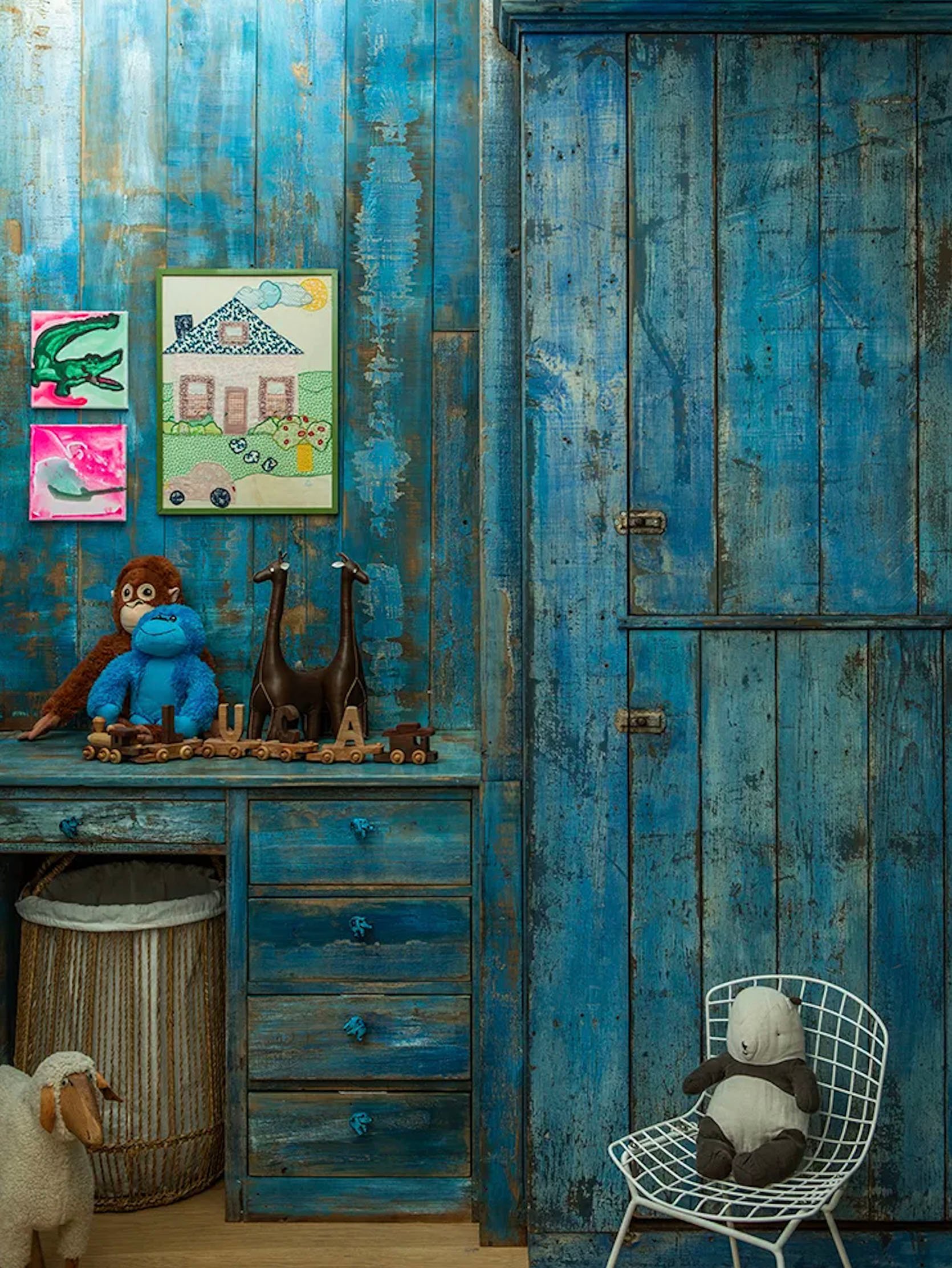
Now, this is his son’s room and I really love this distressed electric blue! The article said that they were inspired by a cupboard from Nickey Kehoe. Another design choice that you may not think would be a fit for an MCM home but the color feels so fresh and the design is awesome. Yet another example that rules need not apply when you have a strong vision. 

Ok, I think this is my actual favorite space/spaces. All the art makes my eyes light up. I mean look at that huge Mark Hagan piece! It’s spectacular. What is also so special about these spaces is that the stone flooring and yellow pendants make them feel like one space, interconnected despite the sliding door. Then you have that insane Willy Guhl-inspired pond and firepit! It’s all too good. One last tidbit. I really love how they chose to paint the overhang on the right gray to contrast the black of what is probably the addition(?). It just makes it look more interesting. A little stone turtle also makes things look more interesting:) 
We’ve made it to the pool and for some reason clicking my red heels three times isn’t transporting me. Very annoying because what a beautiful place to hang out at. I love the green and orange tiles because they feel so true to the era of the home (just wait for the next photo). This is clearly an “entertaining home” since there are not one but two wine racks…outside! I love that they chose to make them different sizes. I also love the continuation of the boulders from the entry to the backyard and how great is it that the left posts are a different color and finish than the right ones. It helps to make a lounge zone and a bar zone. 
Y’all we’ve made it to the end and I’m ending with one of the most fun spaces…the outdoor bathroom. Yes, this beauty is for the OUTDOORS. But honestly, if you can have a pool bathroom why not go bold? The tile choice is obviously continued from the outdoor bar and all those natural materials (ie stone sink and reclaimed wood) speak to the outdoors. But then that great mirror and metallic fixtures make it so it feels modern. So that’s it! Clearly, this is someone with a much larger budget than probably most, if not nearly all of us, will ever have. However, there are a ton of awesome and interesting design choices that we can all learn from and maybe even incorporate into our homes, on our smaller budgets. But now let’s talk about your favorite parts! What did you love? What maybe wasn’t for you? Are you inspired? I hope so. Love you, mean it. Opening Image Credits: Design by Shari and Brandon Creed | Built by Design Universal Architects | Photos by Laure Joliet | via Architectural Digest The post How To Do Mid-Century Modern The “Modern” Way RIGHT From A Famous Music Manager And His Wildly Talented Mother (A True Design Dream Team) appeared first on Emily Henderson. Originally from Emily Henderson https://ift.tt/08ocsp6 
I had no intention of showing the internet my body in a swimsuit so much, but it was born out of my own discomfort in being in one (not having the right supportive suits EVER) and figuring if I’m this frustrated by the industry (and the lack of non-model body representation) then others must be, too. I mean, of course. So it’s been 3 years since my first review and we are so happy to report that FINALLY, the smart brands are showing suits in many different sizes and shapes. WAHOO. Not only does this help people of different shapes and sizes make better choices for their bodies, but it just helps normalize the beauty of all bodies and reduces the pressure to look like models with totally unattainable/photoshopped bodies. The more we see cellulite, the less ashamed of our own we are. I’m also SO impressed by the female-founded brands who are changing the industry and making more supportive suits with compression technology to help show off what we love and conceal what we maybe don’t love as much. So despite gaining some covid weight, today I’m showing you two last suits (I think) that I find VERY comfortable, flattering, and supportive (as well as rounding up all the posts we’ve done about suits for those of you with different body types) and talk all things spray tan. The Sustainable and Sculpting One
A supportive, flattering compression suit (whatever that means to you) that shows off what I’m relatively proud of (for me a supportive boob area) and diminishes what I’m sensitive to (a very soft belly, with a lot of dimples). Lucky for us, the technology of suits has come a LONG way and there are many companies designing suits with this in mind. The compression of the Vitamin A suit is EXCELLENT (FYI the bikinis, which I also tried on, run so small that even the large was pretty tight). I wear an M/8, I’m 5’4” and around 132lbs. The Summersault one-piece suits, same thing – so good. And great news! Summersalt is having a 30% off sitewide sale with code: SALE30. We did a whole review if you want to check them out on a bunch of different bodies. The Sculpting Corseted One (Designed By A Mom!)
Today, what you can see above is the new shapewear suit invented by a mom in Silverlake (where we lived in LA) and it’s GENIUS. Her whole thing is why have shapewear for under your clothes and not for swimsuits! I bought one because I was being heavily Facebook marketed by it and I’m glad I did. Now, one of my best friends tried it on who has a much longer torso and is very small-chested and it didn’t work for her. We decided it’s mostly for people who carry more weight in their midsection and need more boob support. I LOVE it and before this post, I ordered the high-waisted sapphire in “short” Medium just in case we sell it out. That’s how much I stand by these suits. The Swimsuit PostsBut that’s just my body, so this year and last year we did a few swimsuit posts to help you with other body types find a suit that could work for you (long gone are the days of swimsuit shops where you can try them all on). So let’s start from the beginning… Active & Modest Swimsuits That Make Me Feel Good (Plus, My Thoughts On Body Image) Plus Some Updated FavoritesThis was my first ever swimsuit post where I modeled cute but modest one-pieces (my preferred style). I was real nervous putting my body on the internet but the response was so positive that it kicked off what would be an annual post! 
Swimsuit Review (On My Actual Body) – Supportive Swimsuits That Make Me Feel Comfortable, Confident, and StylishSame opening photo, different swimsuits. This one is filled with mirror selfies, more affordable options, and a couple of bikinis. 
Another Swimsuit Review: This Time On 27 Different Women With Different Bodies & Swimwear NeedsAs I said above, my body is just one kind of body. So I hit you all up on Instagram and asked whoever was willing to send in a photo of them in their favorite swimsuit. We were so grateful for the amazing ladies that sent in their photos and gave us some incredible options (my team included!). 
Unphotoshopped Women Honestly Review Summersalt’s 3 Bestselling SwimsuitsWe got to do a sponsored post with Summersalt to review their 3 bestselling one-pieces and it’s fair to say that we were all impressed! Go take a look and there are a ton of other cute ones on the site. 
Where To Buy ALL The Best Swimsuits (Affordable, Black Owned, AND Size-Inclusive) – Because I’ve Been Heavily Insta-Marketed, Believe MeIf you are just looking for a list of great places to find a great new suit, this post is for you! 
Now onto getting that summer glow… Self-TanningI can say without hesitation that I’m an expert in this category. I’m extremely pale as I have shown you before and was called “Powder” growing up. 
When I was a tween I prayed (literally) for the day when I could be tan like other people in the summer and I’m happy to report that God exists:) The difference between me being confident in a suit and me not being confident is having color on my body. I’m not proud of that and I wish I could just be me, but societal beauty conditioning is extreme and often feels irreversible so here we are. Self-tanner is basically foundation for your body that works with your PH to bring out color, and reduces the appearance of cellulite, bruises, veins, etc. Listen I don’t want promote this idea that pale skin isn’t beautiful because it absolutely is or that anything is wrong with cellulite because we ALL have it so it should be 100% normalized despite its lack of representation in the media. I’m just saying that I feel more comfortable in a swimsuit if I have self-tanner on my body and in case you do, too, then here is what I do. 
Self Tan Classic Bronzing Mousse | Double Sided Luxe Tan Applicator Mitt I have done (and will do) a custom spray tan from a person (which can last a full week), a spray booth (4-7 days and I prefer the Versa brand of booths so call around), or at-home self-tanning foam/lotion (2-5 days) with varying degrees of success. My hands-down favorite is St. Tropez self-tanner mousse and be SURE to use the mitt. I also love Coco and Eve (get medium unless you are very dark – it makes me SO DARK) and recently bought Il Makiage which doesn’t get on your clothes as much and works more quickly but doesn’t get as tan or stay as long. All self-tanners come off your clothes and sheets but it can be super gross on day one (wear dark and loose). On vacation, I’ll bring my St. Tropez and reapply every night because if you are in the water it will come off pretty quickly. Chlorine will all but take it completely off which is a bummer (you can’t see it in the water, I promise). If you have more natural color and just want it enhanced then you don’t need the expensive stuff – go for L’Oreal or Jergens Actually, I talked about the St. Tropez self-tanner mousse so much that my team was extremely curious. I decided I would get it for all of them to try and they loved it too. Here it is on Jess and Mallory: 

So there you have it. All the swimwear and tanning picks and advice I have. I hope that we can all spend as much time as possible outside and in the water this year, feeling as good as possible. xx Opening Image Credits: Photo by Veronica Crawford | From: The Fun, Easy To Wear And BOLD Dresses I am Opting For This Summer The post The Link Up SPECIAL EDITION: Emily’s Ultimate Swimsuit Guide (+ TWO Shaping/Sculpting Swimsuits AND Her Fav Self-Tanning Resources) appeared first on Emily Henderson. Originally from Emily Henderson https://ift.tt/h3A51pJ 
To no one’s surprise I “enjoy” the decorating process more than the renovation process. To be clear, I appreciate the renovation process as it’s more creatively challenging and pushes me further and harder, thus can be more rewarding in the end. But OOF, the decoration and styling process is just more enjoyable. The stakes are relatively low, nothing has to be permanent, and everything is a lot less expensive. As you know I’ve started investing in a few new pieces – an extremely comfy TV watching family sectional, our perfect dining table, and our special counter stools, but if I can find the right thing that’s vintage, I WILL buy it. On the weekends when I feel overwhelmed with the renovation and want to “have fun” I jump on Facebook Marketplace or Craigslist, head to the antique malls, and even have a few pickers shop for me. So here are some of my latest scores… Post Modern Pine Chair And Nightstand
Look at that chunky little monkey. This chair and matching nightstand were by far the splurgiest FB marketplace thing I’ve bought thus far. They were $500 for both (including delivery) and the only reason I felt ok about it is because I had been eyeing many that were similar on 1stDibs at 4 times the price, many in Europe which could cost a lot to transport (and I do want to be careful about ordering from so far away for carbon footprint reasons). 

These two are generous in size (bigger than a kids’) and once stripped, sanded, and sealed will be a pretty light pine like our nightstands at the mountain house (which were much more expensive). I obviously love the rounded legs and while this is a trend, I feel very comfortable buying this trend in a high-quality vintage piece rather than a new mass-market piece (nothing wrong with that, but this is my preference). Here are similar vibe options: This one is a modern option, this is a budget-friendly option, and this one is a cool vintage set option:) The Aged Planters
Big heavy planters are expensive, so when I find unique ones like this I JUMP. These were $225 each which is also splurgey but I could see them so perfectly in the kitchen patio area. Paired with a taller-footed gentleman and perhaps my 7′ wooden bird sculpture, these feel so happy and whimsical, especially in the winter months. The Vintage Basketball Hoop Inspired Chair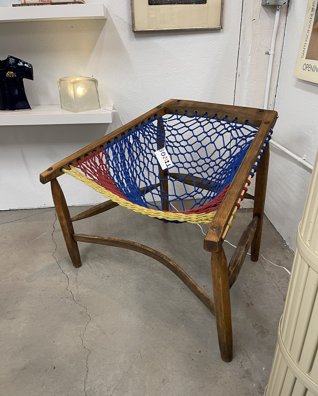
I was drawn to this immediately because it looked playful and so fun. We were shopping after Mother’s Day brunch, forcing my children to come along after 2 mimosas obviously, and when Charlie and Elliot saw this they both freaked out. I sat in it, ensuring comfort and it is really comfortable! Way more than most sling chairs, actually. It was $245 and worth it, IMHO (and no, I rarely try to bargain with vintage dealers as I know that their profit margin is slim already and I have the budget to pay in full. Urbanite gives designers a 10% discount which is lovely). If you are into postmodern design, follow THNGS on Instagram and see what they are collecting. They are out of Portland and it’s all my kid’s dream furniture. Vintage Metal Garden Table
What you can’t tell from this photo is that the dark paint underneath is the perfect blue. I loved those chunky round legs (again) and could picture it in not one, not two, but THREE different places making it a worthy versatile investment (kitchen patio, next to our bathtub, as a plant holder in the sunroom). I believe this was $115, again not cheap, but LOVE. Tromp L’oleil Ghost Table

I told Annie, from Shop Wilma that I was shopping online for a ghost side or console table and a few weeks after that, lo and behold. She was about to have a sale that day so I snagged it for a cool $700 which is actually a deal as they are on 1stDibs for $4,500. Of course, they are being knocked off now which sucks (and is understandable) but the real ones do look better. Scallop Console Table
I bought this the first week we were here for around $100 including delivery. I had ideas of making it a bathroom console, cutting out for the sink, but it’s pretty shallow. I bought it anyway because it’s so cute and I have plans to paint it a fun or dark color. Blue Architectural Swing Lamp
Sixty bucks. Cute color. Not sure where it’s going to go but likely a kid’s room. Popsicle Lamp
This is a very specific movement that some of us are VERY into. So into, in fact, that they go for $2500 on 1stDibs. So I told Annie (Shop Wilma) that I was desperate for one, she texted me a month later, finally finding one for $285. Still a lot for a lamp, but they are hand made from, you guessed it, popsicle sticks in a tramp art type of way. This one isn’t perfect (dusty and maybe janky) but there is still something so whimsical and rebellious about them. To take something so elementary (popsicle sticks) and painstakingly turn them into works chic lamps through such engineering precision is really special. Antique Maple Dressers
Elliot wants “SO MUCH COLOR, RAINBOW, AND UNICORN EVERYWHERE”. So to help foster her creativity (without literally committing to it), I am buying used furniture to experiment on and she has to help do it. If she wants a hot pink dresser, we’ll paint a hot pink dresser TOGETHER. Like me, she needs to understand the work that goes into making something, and not just willy-nilly get what she wants. She wants drawers of different colors and I’m not going to custom-make something like that for her. Instead, we are going to do it ourselves. So again, these dressers are our experimental pieces and I’m SO excited to do it together. They were both $200, including delivery. 
This is more vanity sized, but look how sweet that scalloped shape front is. Love. Mid-Century Art Desk With Storage
So this is where I might have really gone too far. I was so excited about this desk where the wheeled chair (that birdie is sitting on) pushes in flush. It has so much storage (underneath her seat and on the side) and she is OBSESSED with it. It’s been 5 months and she does art at it most nights. My plan was to paint it, but I did the “can you deliver it for $20 today” thing where I didn’t inspect it (it was $60). Upon further/later inspection it is not exactly super well made. We can still paint it (thinking a light color) but the outside is not solid wood so it’s never going to be this crisp awesome piece that I had envisioned when I found it. I still love the idea of it, but not sure I can strip and paint it to make it as good as it was in my head when I found it. Head to stories to see more videos of this haul and if you have any other popsicle lamps, wicker ghost tables, Jacob’s ladder or Irish square quilts – hit this lady up. The post Farmhouse Thrift Store Haul – From Facebook Marketplace, Antique Malls + Local Vintage Stores appeared first on Emily Henderson. Originally from Emily Henderson https://ift.tt/kU6SQ0A Ryanns Parents Budget Dining Room Makeover Update: 3 Unexpected DIYs And An Ask The Audience6/24/2022 
Back in December, I introduced my parents’ dining room refresh, a project that started as a bonding/healing experience for my parents and I. When my brother passed away last August it was devastating, so working on a home project together felt like an uplifting distraction. I think we all know how an inviting, beautiful home can do wonders for your soul and mental health so I wanted to help my parents achieve that in their home starting with their walk-through dining room. While this is still joint project between my parents and I, my parents deserve most (if not all) of the credit so far. I’ve learned that when you are designing a space that you aren’t living in (me) you might drag your feet with design decisions. That might make your “clients” (my parents) go ahead and make decisions without you and ask forgiveness later. I can’t blame them and to be fair, this makeover is coming along much faster than my living and dining room which took almost two years to complete. My parents are nothing if not decisive, so as a team our design process mostly looks like this: 1. my mom and I look for furniture options 2. I take too long to find something I really like 3. she finds something she likes and shows it to my dad 4. if he likes it she texts it to me 5. I tell her my opinion 6. sometimes she listens to me sometimes she doesn’t. It never surprises me when they go ahead and make a decision but more than a few times I’ve been pleasantly surprised with how good it’s all turning out. But I am getting too ahead of myself. Let’s circle back to the very beginning. How It Started

The last time we chatted, I shared our plans to give this space a good old fashion refresh, non-renovation style. My parents want a modern farmhouse-style dining room so my dad started by building a barn house door that separates the walk-through dining room from the family room. Once the barn door was up it put the rest of design in motion. The design plan was simple: replace the dated furniture, the light fixture and style with fresh decor and art. I knew we needed a jumping-off point so we focused on getting a new dining table first. 
1. Rachael Ray Monteverdi Dining Table | 2. Farmhouse Table This is one of those instances where I wasn’t making decisions fast enough so my mom went ahead and bought the Etsy farmhouse table. I wasn’t sure if it was the right wood tone or shape for the space but we were going to just see how it went and go from there. But as fate would have it, the table never shipped so after a couple of months my mom got a refund and looked at more options. Again, she and I looked for a table and she found this one on sale. She ordered it (she loves a good deal) and before I knew it the table arrived. Once we saw it in the space we loved it and it was clear that black dining chairs would be a perfect contrast to the light wood tone. THE DIYS
Many of you commented on the last post that we shouldn’t buy new chairs and instead should simply paint the existing chairs black. I admit I was skeptical and honestly wanted to skip this idea and go straight to purchasing brand new spindle back chairs. But if there’s one thing I’ve learned from this project so far, it’s that you might as well try the DIY first. If it doesn’t work, it doesn’t work. But if it DOES then you are likely saving money and being more sustainable. As a lot of you predicted, a little black spray paint really turned these chairs around. 
They are solid chairs and it’s amazing what paint can do. The black color made them instantly more modern and the cross-back design aligns with the modern farmhouse style we are going for. So thank all of you literal geniuses for telling us to do this. Where would we be without you?? (probably $1000 poorer). 

We did the same for the bar stools and they look brand new. You can purchase stools that look exactly like this for $110 each, and this easy DIY probably cost a total of $50 in spray paint. I just love it when a DIY actually pulls off. The next DIY came out of nowhere but ended up turning out better than any of us could have expected. 
My dad has had this desk in his garage for as long as I can remember. It was his dad’s desk and we don’t know how old it is or even what era it’s from, but our guess is it’s at least 100 years old. A few weeks ago my parents were going to sell it and had an interested buyer who told them she was planning on painting it and using it as a credenza. She never showed up to pick it up, so it gave us the idea to try and refinish it for the dining room. It was originally about the same height as the table so to give it more height, my dad added two bun feet to each leg (one square and one round) which also gave the legs a more interesting shape. He then attached a piece of wood under the drawers to create a shelf and finally sanded and spray painted. Voila. This thing actually looks brand-new in person. It’s stunning. 

It truly turned into a SUCH a cool piece that I am so glad we salvaged. It has a unique shape and the matte charcoal color made it feel more industrial and modern. Our only challenge now is how to style it. It’s pretty wide (about 1.5 feet) so there’s a lot of space to play with but too much decor could make it feel cluttered fast. But that’s a problem for future Ryann. How It’s going
Dining Table | Chandelier (similar) Here is what it looks like currently. It’s not styled out perfectly but we all LOVE how it’s turning out so far. The light wood table ended up being PERFECT and all of the black and wood finishes are complementing each other so well. It actually looks like a brand new room which a few months ago did not feel possible at all. Now that the large furniture pieces are here, we have a solid base and just need to add color and texture with decor. 
The new light fixture is from Etsy and really pulls in elements from the barn door making the space feel more cohesive. It’s industrial (which is what my parents wanted) but sometimes I wonder if it should be all black so it doesn’t match the barn door so much. But on the other hand, all black could be too heavy and darken the space. What do you think? 
On the opposite side, we replaced two old fixtures with these farmhouse pendant lights. They are also industrial and dark, so to keep the space feeling bright and airy decor the plan is to keep the decor light and simple. What’s Next?
I am still advocating for a rug here despite some protests. Even though the floor tile is looking better than ever and fits the aesthetic and color palette, a rug would help ground the space and bring in texture and color. While a rug in the dining room can be cumbersome and messy I think it’ll look too good to pass up. Here are a few options I am eyeing: 
1. Modern Oushak Grey Blue Pastel Turkish Style Wool Rug | 2. Kamran Blue Quartz Rug | 3. Kathy Ireland American Manor Medallion Bordered Indoor Area Rug If it isn’t obvious, the main color I want to insert here is a blue. I love a soft almost gray-blue so I am very attracted to all of these options. Which one would you go with? 
What to do with the space above the credenza has already proved difficult to figure out. We played around with a gallery wall because the original plan was to use this space to commemorate my brother and his military achievements, but we ultimately decided this isn’t the right space for that. A gallery wall with family photos is another option but that can be tricky to execute in a modern and fresh way (but it’s definitely possible). The last option is to hang a large painting or ornate mirror which is what I am leaning most towards. Since this is already a busy corner a single piece might be the best idea to keep the space feeling as light and airy as possible. Although we aren’t done yet, a little side-by-side is in order because the progress is already looking 1000x better than the before. 

So that’s where we are now and I am practically giddy with excitement because it’s turning out better than I expected. Huge kudos to my parents (Cheryl and Kevin) for getting the job done and making decisions faster than me. Now be sure to sound off in the comments about whether we should get a rug and what you think we should do above the credenza. I’d love to hear your thoughts. xx The post Ryann’s Parents’ Budget Dining Room Makeover Update: 3 Unexpected DIYs And An Ask The Audience appeared first on Emily Henderson. Originally from Emily Henderson https://ift.tt/4ADWfPx 
Hello my friends, it’s good to be back and I’ve missed sharing my thoughts and feelings around my epic adventure (?…traumatizing event?) of buying and renovating a home in a wildly expensive city. It’s been almost exactly 2 years since I gave you a process post on my backyard. I considered it a journey then because it had been almost 4 years since we bought at that point. We’re still not “finished” (are you ever really?). In the meantime, I want to give you an intro post for our front yard. I want to talk demo, construction, real numbers, the creative process, urban gardening, furniture design, and of course, cats. This will be a multi-part series that will end in a full outdoor reveal which *may* even include our back unit’s outdoor space. So come along, why don’t you? It’s hard to know where to start, but let’s try a quick recap for anyone who needs a refresher or if you don’t want to read all my past dissertations ? 
My husband and I own a 2-on-a-lot property (bought in late 2016), the front unit is 863 square feet, the back unit is 680 square feet. We live in the front and rent the back. At the moment our friends, Hope and Daniel, live there with their sweet pup, Nora. The property is laid out like so: the front has a 2-car driveway, with 2 separate 1-car garages, there’s a side gate that leads through our side yard (where we keep our many trash cans), and the pathway will lead you through our backyard to a gate for the back unit. The back unit has a concrete outdoor space that wraps around the side and back like an upside-down L. When I looked at this house initially all I saw was this potential: we don’t have to share a wall or an outdoor space. After renting in LA for 7 years, the idea of that kind of privacy while maintaining a sense of urban closeness seemed SO nice. Sure, the space is small but no shared walls and your own fenced-in yard? I know for those of you reading this in suburbia it must sound silly, but this setup is GOLD here. Turns out, it’s especially golden when a pandemic hits and you live in a studio apartment with your dog (just ask Hope and Daniel). 
The potential I saw was just that – potential. In its current 2016 state, my entire 5000+ square foot lot was made up of concrete that had been poured haphazardly over the past however many decades. Trees were popping up out of holes in the concrete that were mere inches wider than the trees themselves. In short: it was an ugly, uninspired space that was largely unusable, especially the front unit’s backyard (middle yard?) because it was concrete, but on a hill so you couldn’t even put a chair out there without feeling like you were going to slide out of it. Unfortunately (or fortunately?), what I didn’t foresee is how much $$ and how long it would take me to fully realize this potential. Tale as old as time? As mentioned, I wrote a “process” post 2 years ago and that only included one-third of the outdoor space. 
Long story (very) short, after doing what we needed to do to make both units safe and liveable (termite and mold damage, damaged roofs, wrong-sized pipes, not to code electrical, replacing almost every window, an unusable sewage line between the back and front house, etc, etc, etc) we had NOTHING left for the outside besides a coat of paint. Even though we knew there were things that shouldn’t go too long without being addressed, namely the rotting front steps and garage doors, a persistent garage flooding issue, and a 100-year-old sewage line with a few, um, holes. We were left with no other option than hoping and praying nothing major would happen while we tried to save back up. We painted the front white and back black and called it a day…or a 2 years. 
In 2018 we were forced to deal with a foundation issue which, as it does, snowballed into other projects. In order to get to the root of the foundation problem we had to rip up almost all of the backyard (hereafter when referring to the backyard I mean the front unit’s backyard, not the back unit’s backyard – the middle yard, if you will). If you have to rip up most of a space that small you may as well rip up all of it while the machines are there. You can read more about it in the backyard progress post but I am bringing it up here to mention that one of the things we decided to do while building out the back patio was to tear down the fence/gate situation and do that at the same time since it was the same materials as the patio (concrete blocks and stucco). 


At this time I decided to plant my beloved hedge, so we moved the gate over to leave room for them to come all the way up to the new stucco wall so that they would cover the entire fence in the side and backyard. 
To be honest I’m not sure exactly what the cost was of doing just the gate/wall because it was lumped in with the foundation/patio. The total invoice for that job was $33,000 so I know we didn’t have the money to do anything special with the gate. I had originally wanted to do an arch, but Ron’s (my contractor) guys just whipped this up with scraps of wood and we painted it with the leftover paint in the garage (Squirrel by Behr). If you are curious, the whole reason I was able to do this job was that Ron was willing to wait for me to refinance (end of 2018) to pay him for most of it. The financials are outlined in more detail in my very first blog post. By the end of 2018, we had finished the first installment of our backyard (& paid off Ron!) and it really changed the way we were living. When you only live in 863 square feet, adding outdoor space, especially in a place where you can spend a lot of time year-round outside, it really adds value to your life. Unfortunately, we still didn’t have the funds to do the things we needed and wanted to do in the front yard. We knew that it would be like the backyard and snowball into a much bigger project. From 2018-2021 our home looked pretty much exactly like this photo taken September 2020: 
Three things happened in September of 2020, 1. We replaced that gate because it was not made well and kept getting stuck. (You will see in an after later on) 2. Hope and Daniel moved in and didn’t have a need for a garage (we had previously been renting out the right 1-car garage to the back unit). After making it through 6 months of lockdown with us both working from home in such a small space it took about 1.5 seconds flat to make the decision to move Andrew’s whole situation to the garage so we could have more living space upstairs. The situation: 
3. The shuffle made me start thinking about the front “yard” (if you can call concrete a yard). We had started having some sewage/plumbing issues (weird smells coming back up our drains, mysterious toilet noises), my garage (left side) flooded every. single. time. it rained, and the rotting stairs were definitely not getting better. I had been told not to let the sewage line burst or I would be in for a world of financial hurt. I was getting both nervous for those reasons and anxious for a new project to distract me – even if temporarily – from living in 2020 and frankly sick of living with the lack of curb appeal. My very responsible and totally safe way of doing business (per usge) Here is the laundry list of things that needed to be addressed in the front yard/garage/driveway area:
I started getting quotes in September and ultimately decided to use the devil I knew (Ron). He came in cheapest at $60,000. It’s a lot but it’s also something we knew would have to happen since 2016. Back in the ole saddle with Ron. You should have heard the resignation in my friend Lauren’s voice when I told her. I made Ron pinky promise (because you have about a 50/50 chance of getting a contract from the man – he prefers used napkins from his car) and swear on his firstborn son (that he sends to pick up his checks from me) that it would not go one cent over $60,000 (spoiler alert: it did). I’m here for you to learn from, or to judge, whatever. Because of the steep price tag and the impending rainy season, we waited until April 2021 to start the work. For cosmic reasons that I don’t understand: I went out of town for weeks the day before it all started. This seems to be a bit of a bad habit. I get us deeply entrenched in a project and for one reason or another (mostly outside of my control) I have to leave town and am left to try to talk remotely through a husband who thinks this is an acceptable way to style a space: 
In The Shit, Quite Literally.Andrew sends me this absolute BEAUT on day 1: 
You spend every day of 4.5 years dreaming of this day, only to not be there in person to have the satisfaction. UGH. Day 1 also came with the awesome news that we have a completely corroded water line we need to replace as well, OF COURSE. Wanna know something REAL gross? The busted sewage line was backed up to a, let’s just say, unsettling degree AND it also had many holes in it. Not to mention it shares the same general area as my water line that also had holes in it…I’ll let you do that DISGUSTING math. I wish I had some pics of this to show you. However, my husband was in charge and mostly sent me videos. I’ll post on my stories or something so you can come watch and gag if that’s your thing. 
We had no idea about the water line needing to be replaced so it’s day 1 and Ron is talking about how this is going to add to the budget (pinky promises be damned I guess) so we decided to not do the driveway apron because if you don’t know – it’s weirdly expensive. I had a couple of people that came out and gave me quotes say that *just* the apron could cost up to $15,000. Ron, in his unending optimism despite this house costing twice as much to fix up than he thought, wasn’t quoting me that much for the apron. However, when I told him $60,00 total was still firm and could he swap out the water line for the apron, he said yes. So alas, my apron still looks like sh*t. Someone please tell me why the city makes me pay for it anyway?? It’s technically their property but I have to not only pay to fix it but also pay the city a separate fee as well?? Tell me a scam that’s become more normalized. Day 2 they started the stucco wall along the left side (if you’re looking at the house), ran the new sewage and water line, and laid the french drain. Again, limited pics but I found a video of Andrew promising he “saw the new line before they buried it” so that’s reassuring, I guess. I literally cannot believe I’m writing about such boring things. So let’s move on. 


By day 7 they had finished all the trenching for the half wall, framed out the walkway/steps leading to the side gate, graded the driveway, and did, I don’t know, whatever you do before you pour concrete? I guess just put rebar in a grid pattern? I’M NOT A SCIENTIST. (pics below for reference). I can’t tell you how long I spent trying to figure out how/where the walkway steps should go and what was the appropriate amount of space to leave for cars and walking around cars. Actually, I can, and will I’m sure in another post. I have some regrets, I think. I don’t know. We’ll see and find out together! I depended on Ron’s judgment a lot here. We talked through how much space we would want on the right side of the driveway for people to walk up to the house or to the gate. Where the steps should be considering us coming from our cars and people walking from the street. We discussed if someone was moving furniture in or out of the back house, how much space they would need to maneuver around on the steps, and the area we call a “landing” (between the initial steps and next to what would be the green space). All that said, I ended up with a lot less space for landscaping than I imagined in my head and now that it’s all there I wonder if I could have pushed for a *little* less concrete. I have some ideas on how to fix this visually, and we will get there in a later post. 


Coming TogetherYou know the point in a project where you start to really see it come together? That was the new driveway for me. Luckily I was home for a few days while they were laying the concrete. Not to take away from how satisfying it was to see that finally happen, but I was mostly here to make fun of these nerds: 
Did you all know that all men become dads even when they don’t have kids? Something happens overnight and one day they are tucking their shirt in their shorts and you catch them standing with their arms folded watching construction workers on your street. To say this was a real treat for Andrew would be an understatement. They poured the steps, driveway, and inside of the new wall all in a matter of hours. It was actually very zen to watch them even it out. 


They had put in the support they needed for the new patio pre-concrete so all of that was ready for the next step, which was to build a new wall on the far left and continue the middle wall between the two garages. They built those walls and did the L-shaped wall along the perimeter of what would become “the green space”. You can’t exceed (I believe) 4 feet high along the sidewalk without a permit so we kept it low, 29” tall to be exact. That random measurement was how high however many cinder blocks made that height because adding another one would have made it too high. I knew I wanted to plant something on the inside and have it grow up to match the height of our neighbor’s fence and I liked the idea of seeing some green from the street vs seeing just a white wall. 


Why the wall at all you ask? Why not just plant a hedge and call it a day? The reason is that the house sits on a hill so I wanted to be able to block off that space and add dirt to even out the ground in that area. Originally the plan was to make an L-shaped planter out of the concrete blocks and have the planter be the divider with plants coming out of it. When we measured it out we realized that it would eat even more into the already not huge space (16’x16’) and decided this was a better direction. I didn’t know exactly what I was going to do with the space at the time but I knew if it was going to be on a hill that was going to restrict my options. Now if I knew just how much dirt I was going to have to add in order to make it level, I probably would have added the extra row of cinder blocks, but that’s a story for another day. Let’s talk patio and garage doors. In order to avoid having an engineer come out, we kept the upper patio pretty narrow. The original steps were 40” wide and we kept the basic structure there but replaced all the rotted wood. This made it a “repair” and not a new build which would have cost a lot more money and required a few permits. We pulled the new wall out to match the width of the stairs. They did all of this after they had already made the new doors so it could happen quickly and all of our garage contents wouldn’t be exposed to anyone who walked by. 
I told them to make the doors to match the new gate, which was a simple design of vertical wood and no trim, so when these bad boys went in I was not too pleased. I felt like the trim made it look like a barn. Also – they were made terribly. They don’t look so bad here but look at this close up: 
EW. What and why I ask. WHAT AND WHY. So not only did I hate the trim but the trim literally made the function of the doors…dangerous? We had a few splinters to prove it. And on this emotional cliffhanger, I will leave you today. Will I reach past my fear of confrontation and demand the hardworking men fix this mistake? Do I trust the people who thought this was ok to fix it? Will rain come before they put the patio/roof back on my garage?? Ha, it’s actually not that wild, but I need a place to split this up. Up next: the patio design and execution and my 16’x16’ urban garden dreams coming true with Down to Farm! Here’s where I leave you: It’s May 8th, 2021 and I have a very much improved driveway situation, peace of mind of all the boring stuff taken care of, and with lots of questions regarding the patio and garage doors: 
AMA in the comment section! The post Emily Bowser Is Back With Another WILD Reno Rollercoaster: The Front Yard (PART ONE) appeared first on Emily Henderson. Originally from Emily Henderson https://ift.tt/NIK8GmD 

I feel like I’m being super slow at choosing major pieces for this house because until we live in it there are so many unknowns. Which way do we want to face in the living room? Will we want a light sofa or a dark one to ground the room once the ceiling is painted white? Two sofas? A sectional? Swivel chairs or comfy club chairs? Etc. So I’m waiting on a lot of those, but with lead times being long I’m trying to just decide on the things we DO know we need (like our family room sectional and our dining table). Today we are talking counter stools and showing you what we wanted and why. 
As you can see the kitchen is open to the living room so I had to design both at the same time. The counter stools will be faced away from the living room but they would be very visible when you are in that room, thus the back of them needs to be right. 
Our Counter Stool Needs And Wants
When possible, for this home I want to work with local makers and this seemed like a great opportunity. I knew this would be the more expensive route, but one that I think is important to go down if you can afford it. So I reached out to Fernweh Woodworking as I LOVED working with Justin on the chairs for the Portland Project. 
Those chairs are incredible sculptures and the craftsmanship is so exceptional. But to be honest we are in the “almost every piece of furniture has to be super comfortable” stage of our lives. So without sitting on these stools how could I guarantee that they are comfortable? I posed my concerns to Justin to which he said he was coming to Portland for a delivery and he would be bring a couple of dining chairs and a bench for us to test- designed very similar to the counter stools. 
Both Brian and I were extremely impressed with the chairs. They are very hefty and solid – not crazy heavy so it makes them hard to move, just solid. They are generously proportioned – they aren’t dinky little stools that you feel like you are spilling over. And the shape of the seat and the shape of the back are so comfortable. Despite not being upholstered they are shaped in a way that just feels so good! 


And almost most importantly, they strike the perfect balance between minimal, modern, classic, and warm. They are absolutely STUNNING and yet so simple that I don’t think I’ll ever ever ever get sick of looking at them. 


Now for what color? To decide that we had to reference our island as that’s the wood that it’s going to be up against. 
It’s a white oak, but with a pretty warm/red stain (which we really like). The floor and cabinets are a natural white oak so while we could have done the walnut to add in another tone, we decided the black would contrast so nicely against the island, speak to the black in the light fixtures, and yet still be quiet and calm. 


I was SO excited when they brought us samples of their new seat cushions in November. They hadn’t launched them yet, but are now available. The reason they are so special (and genius) is that they are designed to sit without straps or any adhesion – they are so bottom-heavy and sculpted into the seat of the stool that they stay in place. I’m not sure if it’s wood on the bottom or what, but whatever it is, it works. I ordered the black ones for our black stools. What Seat Height Is Best For Counter Stools?Well. This became a thing. I almost wish they had just “counter” and “bar” height because we actually really fixated on the height for a long time. We measured the difference between our dining chairs’ seat height and the underside of the table and based on that we were going to go with 24″. However, Brian claimed (and felt very passionately) that you want to sit higher at a counter than you do at a dining table. He demonstrated this posture many many times when debating this. He says that you want to sit up and put your elbows on the table, to lean your chin on your palm while reading, say, the paper. He is generally right about this stuff and I didn’t feel nearly as passionately about the height as he did so we ended up ordering the 26″. The height of the island is 36″ so that gives 10″ clearance, 9″ if you minus the surface of the island. The amount of time we measured from our thigh to an imaginary counter to see if that felt good was baffling and hilarious. 

Now, these stools are handmade in Bend, OR, and I can’t say enough great things about Justin and his Oregon maker team. Their price point is reflective of their quality, so yes it’s high. They were kind enough to offer me a discount for press and usage, which I was so grateful for but it was still one of the biggest purchases I have ever made, and took us 9 months to convince ourselves to invest. We are SO EXCITED and it feels really good knowing that we are supporting Fernweh. Justin’s furniture is beautiful and so high quality and these are classic enough heirloom pieces that we’ll keep forever and pass down to our kids. We also feel like long-lasting pieces like these will appreciate like art does knowing that they aren’t mass-manufactured. These aren’t pieces that can be produced on a mass scale because they are made by the maker themselves. Not only are they not mass-manufactured, but Justin’s company also prioritizes sustainability. They strive to be waste-free and will be carbon neutral by the end of THIS YEAR. They source all of their wood from the pacific northwest and any wood scraps are put into storage for Justin to use in his home on an efficient wood stove. They even use their sawdust on their 5-acre property and all of their finishes are plant-based. It’s all just so awesome and Fernweh is such an incredible example of how to run a business that tries to protect our resources as best they can. My hope is that in 40-60 years from now Fernweh will be another “Paul McCobb” or “Borge Morgenson”. At least that’s my fantasy, even though we’ll likely be dead ? So if you have the budget, supporting local furniture makers and artists is a great way to spend it. I’m happy to say that their small business is thriving currently because enough people are starting to prioritize smaller high-end makers like this. Go, Justin! Now I know that these stools won’t be in most people’s budget, so we wanted to show you the other counter stools I was thinking about and frankly very tempted by before deciding on ours. 
1. Rye Counter Stool | 2. Harpswell Stool | 3. Proper Bar Stool | 4. The Delancey Stool | 5. Maison Upholstered Swivel Counter Stools | 6. Eastward Stool | 7. Netro Counter Stool | 8. Cobb Counter Stool with Back | 9. The Delancey Stool | 10. Jackson Stool More farmhouse purchases later this week…stay tuned:) xx The post Choosing Our Kitchen Counter Stools – Our Splurgey (And Sustainable) Choice appeared first on Emily Henderson. Originally from Emily Henderson https://ift.tt/hxeyb6S 
Today I’m VERY excited to announce a local Portland Pen + Napkin makeover for a family of four (and we need your help). Last year we took Pen + Napkin national and got HUNDREDS of volunteer designers, many of which are located here in Portland. Two such designers, Amy and Katie Newcomb (not sisters, married to twin brothers!) have volunteered their time to help decorate a home for a family of four (two young girls). The photo above is one of their designs! If you are new here (welcome) Pen + Napkin helps families who are transitioning out of homelessness, usually coming from a shelter. They coordinate (or do it themselves) the furnishing and decorating of the homes as it greatly reduces recidivism. After the makeover, they feel proud, welcome, safe, and warm in their house. As a parent, we all know how important that is and how unsettling it can be to not have those feelings in your home. We do this for the moms who usually are coming from traumatic relationships and for the kids, who are desperate for stability and safety. But we need help – aka some funding to get it all executed. I’ll turn it over to Katie and Amy who can tell you about the project, the design, and the needs. If you can spare $10 they’d GREATLY appreciate it as furnishing a home from nothing can certainly add up (as we all know). 
Melissa, Braulio, Mariah, and Alanna are a sweet family transitioning out of houselessness. Since 2019 they have been through the turmoil of living in motels and campgrounds and being separated multiple times. Covid brought job loss and school closures, and the lack of routine and childcare sent them into a bit of a tailspin. Since 2021 Melissa and Braulio have fought through all that was stacked against them and have both gained full-time employment and a home. The girls are in a stable and permanent home for the first time in recent years and the whole family is excited to be where they are and making strides toward getting back to the life they envision. Their new home is close to their work and the girls’ school. They don’t have a lot to furnish a home so we’re excited to help them turn their new place into a home that reflects this new start. Mariah is in 3rd grade. She loves participating in the chess club at school, learning about science, especially the solar system, and flowers – she was proud to show us the rose bush in her yard! Alanna is a first grader with lots of spunk! She loves dolls, dancing, and the gardening club at school. The girls show such resiliency and happiness; it is hard not to be excited for them to have this opportunity. 


As a small interior design firm in Portland, we are excited for the opportunity to give back to our community. While what we do as interior designers can feel a bit materialistic, it is undeniable that having a home environment that makes you feel safe and happy affects people in such positive ways. We want everyone to have a stable home, and whatever part we can play in this is important to us. Personally, the two of us have children the same ages as this family. These girls are peers to our kids and part of our future generation. We feel an emotional connection to helping set them up for the same success and stability as our own children. We are so excited to be a part of bringing this family a new beginning. 


If you are able to contribute (THANK YOU) you can donate directly to Pen + Napkin here, or you can purchase one of the below items from the wishlists: 

Emily here. We appreciate any support you can give whether it’s donating or simply spreading the word. Again, thank you to our friends at Pen + Napkin for all the incredible work they do, and to the designers Amy and Katie for taking the lead on this special project. xx Opening Image Credits: Design by Kith and Kin Interior Design | Photo by Folk Family Photography The post Introducing A New Pen + Napkin Feel Good Makeover Here In Portland…And We Need Your Help! appeared first on Emily Henderson. Originally from Emily Henderson https://ift.tt/AiNtpwB |
